Art for a multi-generational household
The most reliable approach: choose each room's art for the person who actually lives in it, not one style for the whole house. Shared rooms can hold bold, high-contrast pieces; an older resident's bedroom generally reads best with a tonal, medium-contrast palette and warm, glare-free light.
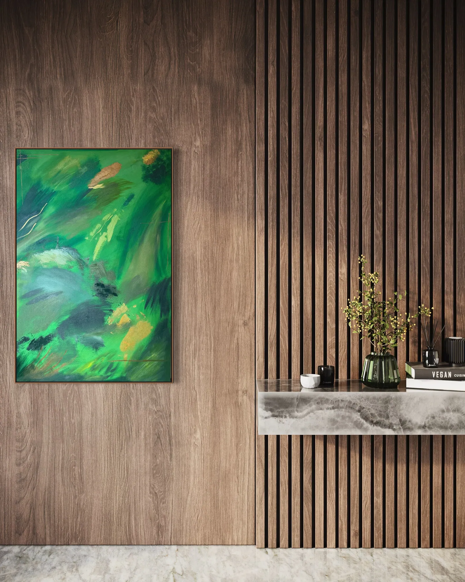
Zoning a multi-generational home by resident, not by house-wide style
Multi-generational living has grown substantially in recent decades. In the United States, the share of the population living in a multi-generational household rose from 7% in 1971 to 18% in 2021, according to Pew Research Center. A household built this way is rarely one household in taste: a grandparent's room, a couple's bedroom and a teenager's room can each carry a different relationship to color, contrast and rest.
The most workable approach we see is to treat the home as several distinct rooms rather than one collection that has to please everyone at once. A shared living or dining wall, seen briefly and in passing by everyone, can carry a bold, high-contrast piece. A bedroom, seen slowly and repeatedly by one or two people, is better chosen for whoever actually sleeps there.
Choosing art for a grandparent's or older resident's bedroom
Contrast sensitivity, the ability to distinguish an object from a similarly toned background, tends to decline with age, and some age-related eye conditions can increase sensitivity to glare, according to the American Academy of Ophthalmology. In practice this doesn't rule out any particular palette; it means a piece with clear tonal separation and a matte, non-reflective surface generally reads more calmly under a bedroom's evening lighting than a piece built from sharp, high-gloss contrast.
A work like Vegetal Dawn (Terra & Ether, 80 × 120 cm, acrylic on canvas, R$ 4,900 — pricing is in Brazilian reais; a USD or EUR estimate is available on request and will vary with the exchange rate) sits in that register: layered greens and malachite tones with small passages of gold leaf, close enough in value that the surface reads as one unified field from across the room, rather than a single sharp shape against a flat background.
What suits shared rooms, adult children's rooms and a home office
Living rooms, dining rooms and entry halls are seen by the whole household and by guests, and are the rooms where a bolder, more gestural piece, something from Heart of Chaos or Black & Gold, earns its place as a statement without living in anyone's direct sightline overnight. Bedrooms belonging to adult children or teenagers in the household can generally carry more saturated, energetic work than a grandparent's room, since it's the resident's own preference, not a shared house rule, that should govern a private bedroom.
A home office used by one working adult in the household follows its own logic again. Our guide to art for a family office covers how that room's needs differ from a bedroom's, particularly around scale and video-call backdrops.
Hanging height and mounting, room by room
Hanging height in a multi-generational home isn't one number. In the studio's own practice, we typically center a piece around 145–150 cm from the floor for a viewer standing at average adult eye level. A resident who spends most of their time seated, in bed or in a chair sees the wall from lower down. In that room, hanging 10–15 cm lower than the standard guideline, and centering the piece over the chair or headboard rather than over the room's midpoint, keeps the art at the sightline it will actually be seen from. Our guide on sizing a painting for a bedroom covers the fuller sizing logic.
Mounting matters as much as height in a household with more people moving through it, including children, grandchildren and visiting caregivers. Any large original canvas should sit on two wall anchors rated for its weight rather than a single hook; our guide on hanging a heavy painting on drywall covers the hardware in detail.
From the studio
From the studio
As an architect before a painter, I think about a multi-generational house the way I'd think about a building with several kinds of occupants under one roof: the question is never one finish for every room, it's which finish serves which use. When a family writes to me about art for a house with parents, grandparents and children under it, I usually ask which room we're solving for first, because the answer for a grandparent's bedroom and the answer for a shared living room are rarely the same piece, and shouldn't be.
Terra & Ether, the series Vegetal Dawn belongs to, is built around layers that hold together without flattening into one texture, mineral strata in some pieces, vegetal growth in this one, each layer legible on its own. It's the series I point to most often for a room meant to be read slowly, over years, by one person.
Frequently asked
Does art for a grandparent's room need to be chosen differently from art for the rest of a multi-generational home?
Not in kind, but in emphasis. Contrast sensitivity and glare sensitivity both tend to change with age, so a piece with clear tonal separation and a matte, non-reflective surface generally reads more calmly in a room used for rest than one built from sharp, high-gloss contrast. This is a practical preference, not a rule, the same care you'd give to choosing lighting or flooring for that resident applies to the art on the wall.
Should every bedroom in a multi-generational household match the same visual style?
No. Matching every bedroom to one style usually serves the decorator more than the residents. A more durable approach is to let each bedroom reflect whoever sleeps in it, and save any shared visual language, a consistent framing style, a related palette across two or three pieces, or works from the same series, for the rooms the whole household uses together, like the living room, dining room or entry hall.
Do strong contrasts or very dark palettes cause any issue for older residents with reduced vision?
Not a safety issue, but they can change how a room feels to live with. As contrast sensitivity declines with age, a very dark or high-contrast piece can read as flatter or more confusing under evening lighting than it does under bright gallery light. It's worth viewing a candidate piece in the room's actual lighting, including after dark, before deciding. A tonal, medium-contrast work tends to hold its clarity across more lighting conditions.
Is it worth keeping one consistent artist or series across the whole home instead of mixing?
It can work well, and it has a practical upside: documentation. Acquiring several pieces from one artist and studio means one consistent set of Certificates of Authenticity, Archive IDs and provenance records, rather than paperwork scattered across sources. That said, coherence doesn't require identical rooms. Pieces from the same series can vary enough in palette and mood to suit a grandparent's room and a teenager's room differently while still reading as one collection.
Does hanging height need to change for a resident with limited mobility?
Often, yes. In the studio's own practice, a painting is typically centered around 145–150 cm from the floor for a viewer standing at average eye level. For a resident who spends most of their time seated or in bed, hanging the piece 10–15 cm lower and centering it over the chair or headboard, rather than over the room's midpoint, keeps it at the sightline it will actually be seen from.
Choosing art room by room for your household?
Tell us who each room is for and we'll help you match palette, scale and placement across a multi-generational home, including international shipping and documentation.
Sources
- American Academy of Ophthalmology — 2026-09-23
- Pew Research Center — 2026-09-23
Published on