Large abstract painting for a bedroom: how to choose
For a queen or king bed, a single painting should span roughly half to two thirds of the headboard's width — about 90–150 cm (35–59 in) on a standard queen — hung 15–20 cm (6–8 in) above the headboard, centered near the mattress's vertical midpoint rather than at standing eye level.
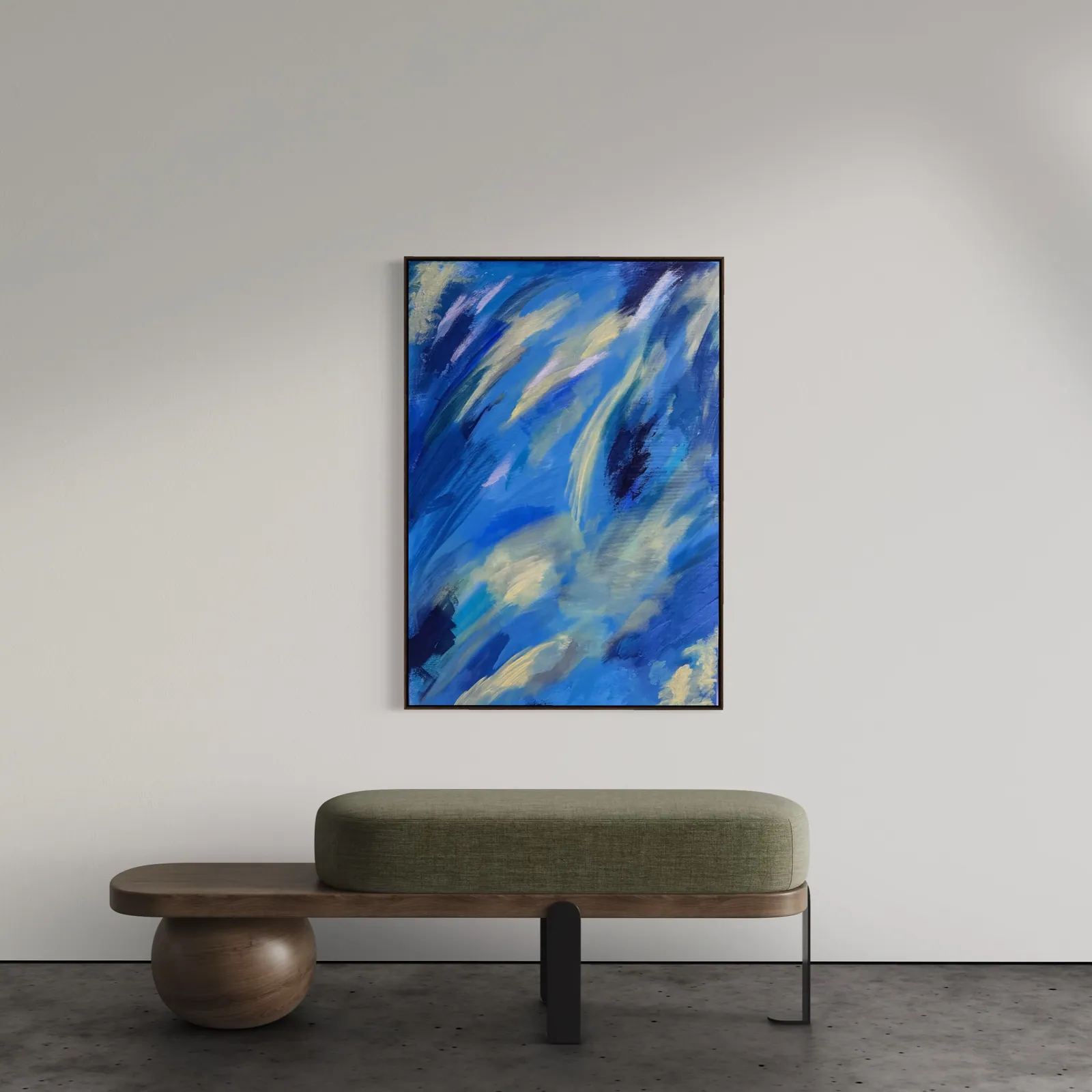
Sizing a painting above the bed: the headboard-width ratio
A queen or king headboard is narrower than most living-room sofas, so the ratio that works over a sofa runs too large over a bed. The proportion that holds up in a bedroom is half to two thirds of the headboard's width, not the two thirds to three quarters used for a sofa.
- Queen headboard (~152 cm / 60 in, standard US sizing): painting width around 90–110 cm (35–43 in).
- King headboard (~193 cm / 76 in, standard US sizing): painting width around 110–150 cm (43–59 in).
- Twin or single headboard (~99 cm / 39 in, standard US sizing): a smaller or square-format piece, around 60–80 cm (24–31 in), keeps proportion without crowding a nightstand.
Clearance matters more here than in a living room, because a bed sits lower than a sofa and pillows add visual height. Leave 15–20 cm (6–8 in) between the top of the headboard and the bottom of the frame, and center the piece on the wall rather than on the mattress if the two don't align — most beds sit slightly off-center against their wall once nightstands are added. Celestial Drift (70 × 100 cm, R$ 3,700), shown at the top of this guide, sits near the lower end of this range and works well over a queen headboard without a nightstand lamp competing for space beneath it.
Calming or bold: choosing based on the wall, not a rule
There's no fixed rule that bedroom art must be muted — the deciding factor is which wall the piece occupies relative to where you actually rest your eyes.
- The wall you face lying down: usually the headboard wall itself, seen from directly below and close up. A piece with too much high-contrast movement here can feel active rather than restful, since it's the last thing seen before sleep and the first thing seen on waking.
- The wall you see getting dressed, or across the room: can carry a bolder, more saturated piece, since it's viewed from a distance and in passing rather than lying still beneath it.
- A reading nook or seating area within the bedroom: behaves more like a living-room wall — bolder color and higher contrast tend to work here without disrupting rest, since it isn't the wall you sleep facing.
A painting built from layered, tonal color — where the palette reads as unified from across the room but reveals more movement up close — tends to satisfy both instincts at once: calm at a glance, engaging on closer viewing.
Vertical or horizontal: matching the wall behind the bed
Orientation follows the wall's proportions relative to the bed, not personal preference alone.
- Behind the headboard: this wall is almost always wider than it is tall, which is why a horizontal piece — or a vertical piece centered with open wall on either side, rather than stretched edge to edge — reads most naturally here.
- Side wall, opposite the bed, or beside a window: narrower and often taller in proportion, which favors a vertical piece. A horizontal painting on a narrow wall tends to overhang its edges or force an awkward gap on either side.
- Above a low dresser or bench: a horizontal or square piece keeps the composition grounded to the furniture beneath it, the same logic used for a sofa wall.
When a piece could go either way, let the furniture decide: orientation that echoes the shape of what's directly below it reads as intentional; orientation chosen only for the painting's own proportions can look like it landed on that wall by accident.
Choosing one painting two people can both live with
Bedroom art is one of the few acquisition decisions made by two people who have to agree, and it's where the most stalled decisions happen.
- Start from what's already agreed on: the bedding, the wood tone, the rug. A painting that answers to a palette already chosen together removes one layer of negotiation.
- Look for tonal range, not a single dominant color: a piece built from several related tones gives each partner a different point of entry — one person drawn to the warmer passage, the other to the cooler one — without either person compromising on a flat, single-hue choice.
- Decide on scale before color: size and placement are easier to agree on than taste, and settling the sizing question first narrows the field of pieces under consideration before color becomes the sticking point.
When the disagreement is genuinely about color rather than scale, a piece that shifts across its own surface — warm in one passage, cooler in another — usually resolves it faster than continuing to look for a single shade both people would have picked independently.
From the studio
From the studio
Bedrooms are the rooms I get the most cautious questions about — clients who love a bold piece in the gallery but hesitate to picture it a meter from where they sleep. My answer usually starts with the same question I'd ask as an architect: which wall are you actually looking at when you're in bed? Not the room in general — the specific sightline from a pillow.
Celestial Drift, pictured at the top of this guide, is one of the pieces I point to most often in that conversation. It reads as calm from across a room — soft diagonal currents of blue and ivory — but it isn't flat or empty; there's enough movement in it that it holds interest without becoming visual noise you'd tire of by the second week. That balance, more than any fixed palette rule, is what I look for when a piece is going above a bed.
Frequently asked
What size painting works above a bed?
For a queen or king headboard, aim for a painting spanning roughly half to two thirds of the headboard's width — about 90-150 cm (35-59 in) depending on bed size. A single piece 70-120 cm on its longest side generally reads well without overwhelming nightstands and reading lamps on either side. Leave 15-20 cm of clearance above the headboard, and center the piece near the mattress's vertical midpoint rather than at standing eye level, since most viewing in a bedroom happens seated or lying down.
Should bedroom art be calming or can it be bold and colorful?
Both work, and the right answer depends on how the wall is used rather than a fixed rule. A wall you fall asleep facing benefits from calmer, lower-contrast, or tonal work that won't hold the eye's attention past a glance. A wall you see when getting dressed or entering the room — not the one you sleep facing — can carry more saturated color and movement without disrupting rest. Choose based on which wall the piece will occupy, not a blanket rule for bedroom art in general.
Is it safe to hang a large original canvas above where you sleep?
Yes, provided it is mounted correctly. A stretched canvas is light relative to its size, and a large-format piece should be secured with two wall anchors rated for its weight, spaced to match the stretcher bar rather than hung from a single central hook. It's also good practice to offset the piece slightly from the exact center line above a headboard rather than positioning it precisely over where a head rests. The studio can advise on mounting hardware for a specific piece and wall on request.
Vertical or horizontal orientation for a bedroom wall?
Match the orientation to the wall's proportions relative to the bed, not to personal preference alone. Behind a headboard, where the wall is wider than tall, a horizontal piece — or a vertical piece centered with open wall on either side — tends to work best. On a narrower side wall, opposite the bed or beside a window, a vertical piece usually suits the space better and avoids overhanging its edges or leaving an awkward gap.
How do I choose a painting that works for both partners' taste?
Start from what both people already agree on elsewhere in the room — the tone of the bedding, the wood, the rug — rather than asking each partner to pick a favorite color in isolation, which tends to produce a standoff. Look for a piece with enough tonal range that each partner can point to a different part of it and still call it theirs: a painting built from layered color leaves more room for two people to find their own entry point into the same piece.
Not sure what fits your bedroom wall?
Send us a photo of the wall and the bed's width, and we'll tell you what fits before any purchase decision.
Published on