Choosing a large abstract painting for a living room
For a sofa 2.2–3 m (87–118 in) wide, the painting should span roughly two thirds to three quarters of the sofa's width — about 150–220 cm (59–87 in) on a standard 3 m sofa — hung 15–25 cm (6–10 in) above the frame's back edge, centered at seated eye level.
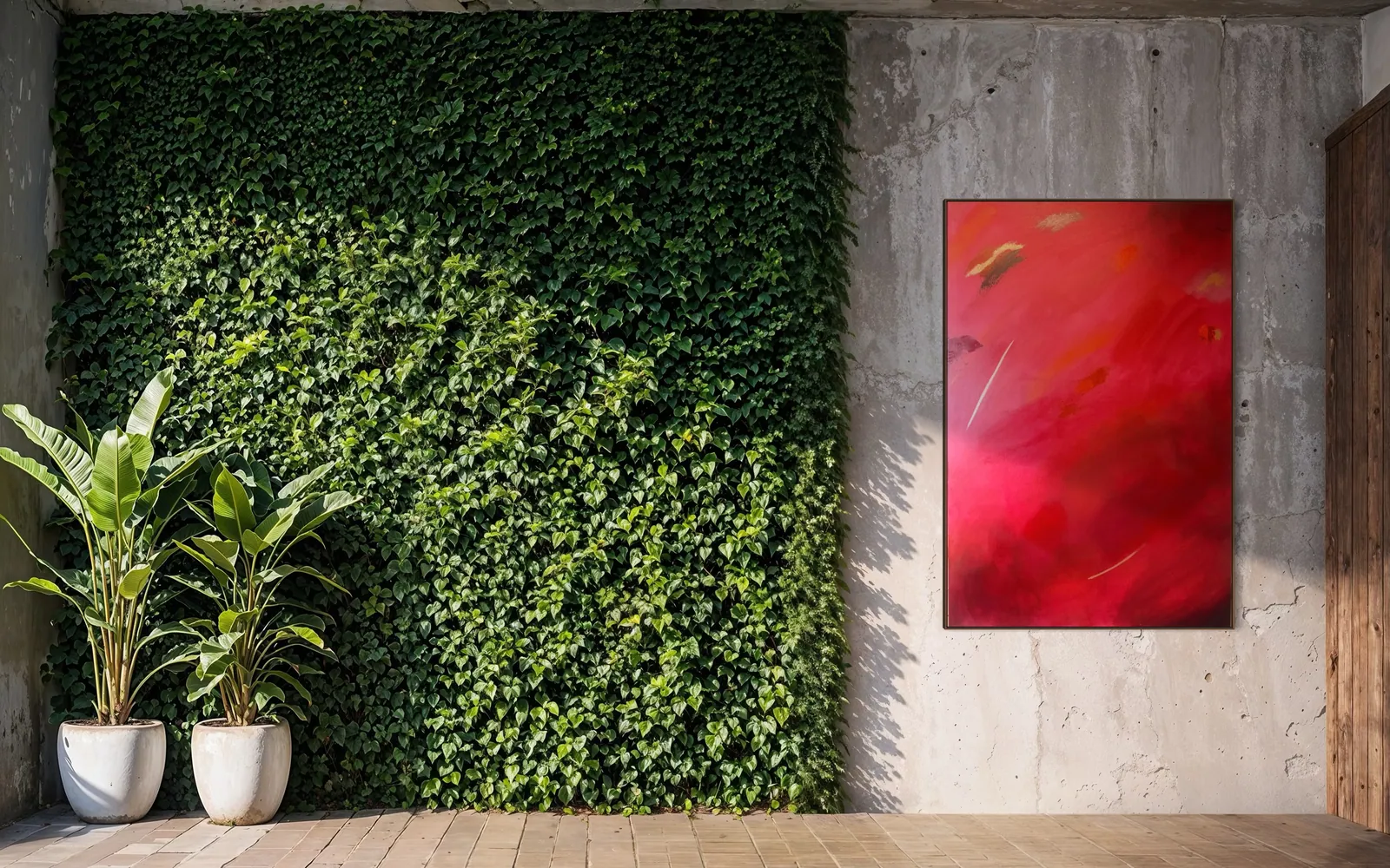
How to size it: the ratio to your sofa
The most reliable rule for a painting hung above a sofa is proportional, not fixed: the piece should cover roughly two thirds to three quarters of the sofa's width. A painting narrower than that reads as an afterthought floating above the furniture; one that matches the sofa's exact width, edge to edge, tends to look rigid rather than composed.
- Sofa 1.8–2 m (71–79 in): painting width around 120–150 cm (47–59 in).
- Sofa 2.2–2.5 m (87–98 in): painting width around 150–190 cm (59–75 in).
- Sofa 3 m (118 in): painting width around 200–220 cm (79–87 in) — at this scale, a single large-format piece up to 120 × 200 cm (47 × 79 in) usually reads better than trying to stretch a smaller canvas to fill the space.
Height above the sofa back matters as much as width: 15–25 cm (6–10 in) between the top of the sofa back and the bottom edge of the frame keeps the painting connected to the furniture instead of drifting toward the ceiling. The center of the painting should land close to seated eye level — roughly 145–155 cm (57–61 in) from the floor for most rooms — not at standing eye level, which is the most common miscalculation when a piece is hung by someone standing in front of an empty wall.
Which wall in the room actually wants a painting
Not every blank wall is a candidate. The wall that actually wants a large abstract painting has three traits: it's visible from a seated point of rest (the sofa, an armchair, the dining table), it receives light — natural or from a fixture — without direct glare bouncing off the surface, and it isn't already competing with another strong element in the same sightline.
- Wall behind the sofa: the most common choice and usually the most effective — the painting becomes the backdrop of the room as seen by anyone entering it.
- Side wall along a walkway: works better with a vertical format, since it's seen at an angle and in passing, not head-on and at rest.
- Wall behind the television: almost always the wrong choice — the painting loses to the screen when it's on, and even off, the TV's black frame competes with the painting's frame for attention.
- Wall next to a large window: watch for backlight — if the window sits in the same field of view, the eye goes to the light source, not to the painting.
A practical test: if your eyes don't naturally land on that wall when you walk into the room, it isn't asking for a painting — it's asking for something else (a mirror, a shelf, or nothing at all).
How to choose the palette from what the room already has
The right question isn't "what color do I like," it's "what color already dominates this room." Flooring, sofa upholstery, curtains, and the largest textile surface in the space form the room's base palette — the painting enters as an accent or a continuation of it, not as an isolated choice made in a vacuum.
- Neutral base (gray, beige, white, light wood): takes a saturated, high-contrast piece well — it's the setting that allows the most color contrast.
- Sofa or rug in a strong color: calls for a painting that sits close in tone or complements it — two strong colors in the same sightline split attention instead of guiding it.
- Rooms heavy in wood and earth tones: pair well with mineral, layered palettes that reinforce a sense of material and continuity.
- Cool light (north-facing rooms, or mostly white artificial light): warm tones in the painting balance the room's visual temperature; a room that already runs warm calls for the opposite.
In practice: photograph the room in good daylight, look at the photo rather than the room in person (a photo reduces distraction), and identify the two or three colors that recur most. That's the palette the painting should answer to.
One large piece versus a group, and when the group fails
A single large piece tends to work better in a living room than a group of smaller ones — it's simpler to get right, because it removes the problem of alignment, spacing, and hierarchy between pieces. A group adds decisions that show immediately when they go wrong: uneven spacing, pieces whose scale or palette don't speak to each other, or an alignment that respects neither the center of the furniture below nor the center of the wall.
A group works when the pieces belong to the same series or palette (which avoids visual noise), the spacing between them is consistent and proportional to their size, and there's a clear alignment axis — top, center, or base — that organizes the eye. It tends to fail when it mixes pieces of different styles and temperatures just because each one looked good on its own, or when the whole arrangement ends up smaller than a single large painting would have been — which is really the sizing problem from the first section, arriving from a different direction.
When in doubt: on a wide, uninterrupted wall, one large piece is usually the safer choice. A group asks for more judgment — and more measuring before anything goes on the wall.
From the studio
From the studio
Before I was a painter, I trained as an architect, and that's still the order I think in when I'm asked about a painting for a living room. I don't start with the piece — I start with the room: where it will be seen from, and at what distance. Someone seated on a sofa reads a wall differently than someone standing at the doorway. Seated eye level is lower than most people account for when they hang a painting standing up — it's a mistake I've corrected on my own walls more than once, after living with a piece hung too high for a few days.
Daylight changes a painting through the day in ways that matter as much as the wall itself. A room that gets morning sun and afternoon shade makes the same canvas read as two different paintings depending on the hour. I factor that into scale and palette when I paint something meant for a living room — it has to hold up in the low warm light of late afternoon and in the flatter, more neutral light of midday.
It's also why I paint a large part of the collection at a large scale. A living room has a longer viewing distance than a bedroom or a hallway — people aren't standing 40 cm (16 in) from the canvas, they're sitting three, four, five meters away. At that distance, a small painting loses texture and presence. Large format is what keeps the gesture, the layering, and the surface relief legible from across the room, which is where most people are actually going to be looking at it from.
Frequently asked
What size painting should I hang above my sofa?
As a rule of thumb, the painting should span roughly two thirds to three quarters of the sofa's width. For a standard 3 m (118 in) sofa, that works out to about 200–220 cm (79–87 in) — a scale where a single large-format piece, up to 120 x 200 cm (47 x 79 in), usually reads better than a smaller canvas stretched to fill the space.
How high above the sofa should a large painting hang?
Leave 15–25 cm (6–10 in) between the top of the sofa back and the bottom of the frame, with the center of the painting close to seated eye level — roughly 145–155 cm (57–61 in) from the floor in most rooms.
Can I see how a painting will look on my wall before buying?
Yes — send a photo and the measurements of your wall and we can share a photo or short video of the piece in the studio for scale and color reference before you decide.
Can a large canvas be shipped abroad — rolled or stretched?
Large-format canvases can ship internationally either way: stretched on its frame for local delivery, or carefully rolled (unstretched, protected in a rigid tube) for international shipping, then re-stretched on arrival. Which option applies depends on destination and size — ask before ordering.
Is one large painting better than a group of smaller ones for a living room?
A single large piece is usually the safer choice for a living room, since it avoids the risk of uneven spacing or misalignment between pieces. A group only works well when the paintings share a series or palette and are spaced consistently.
Not sure what fits your living room?
Send us a photo of the wall and the measurements, and we will tell you what fits before any purchase decision.
Talk to the studio on WhatsApp
Published on