How to light a textured or impasto painting
Light a textured or impasto painting from the side, not straight on: aim the main fixture at roughly 30° to 45° from the wall, using a warm 3000K–3500K light with a Color Rendering Index of 90 or higher. Flat, overhead, or head-on light lights every ridge of the surface almost equally, which erases the shadows raised paint depends on to read as texture.
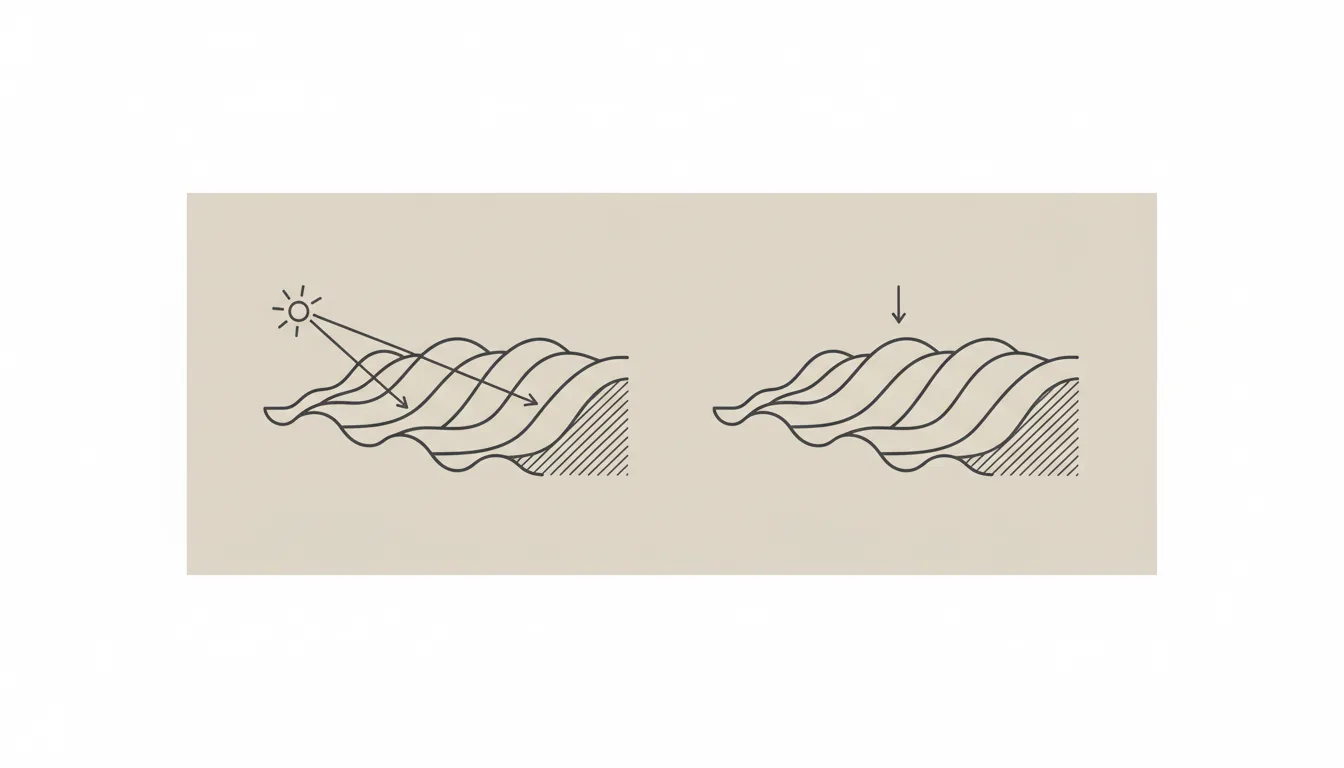
The lighting angle that keeps texture from disappearing
Raking light is light striking a surface at a low, oblique angle rather than head-on — "the illumination of objects from a light source at an oblique angle or almost parallel to the surface," with shadows accentuated on the side of every ridge facing away from the source. For a textured or impasto painting at home, that principle translates into a practical number: aim the main fixture at roughly 30° to 45° from the wall, not straight down and not flush against the surface.
Conservators rely on the same geometry for a different reason. At the Cincinnati Art Museum, conservators use a light placed at one side of a painting, traveling across the surface at an oblique angle, specifically because it can enhance the visibility of brushwork and impasto — texture that is already visible under normal light but reads far more clearly under an oblique beam — and because it exposes fine surface condition, like hairline cracking, that stays invisible under normal, even lighting. A home fixture aimed too directly overhead lights the peaks and valleys of a textured surface in close to equal measure — the same thing a straight-down beam does — and the relief disappears much the way it does in a flat, front-on photograph.
Color temperature and CRI: what actually changes how the paint reads
Two numbers do most of the remaining work once the angle is right: color temperature, measured in Kelvin, and the Color Rendering Index (CRI). For a painting in a warm-lit room, a color temperature of 3000K to 3500K keeps warm pigments — reds, oranges, golds — reading as they were mixed; in a cooler-lit room, 4000K is the closer match. A separate LED-focused gallery-lighting guide puts the useful range slightly lower, 2000K to 3000K, for "accenting the light while maintaining the color palette" — the two ranges overlap around 3000K, which is a reasonable default for most rooms.
CRI matters independently of color temperature: it measures how accurately a light source renders color compared with natural daylight. A CRI of 90 or higher is the threshold most lighting guidance for paintings converges on, with one source warning that anything lower risks colors that read as "muddy." A separate LED-specific gallery guide sets a lower floor of 80 for "true color," which is worth checking if a fixture's spec sheet only clears that bar. On a heavily textured piece, where shadow and highlight already carry a lot of the visual weight, a CRI toward the higher end of that range keeps color from working against the texture instead of with it.
Picture lights and track heads: sizing and placement
A dedicated picture light — the small fixture mounted directly above a frame — is sized to the piece, not to the wall. The general rule is a light at least half the width of the frame it illuminates, and for anything over 30 inches wide, a fixture measuring two-thirds or more of that width, so the beam covers the surface evenly instead of leaving the edges in shadow. Ceiling-mounted track heads can follow the same 30°–45° angle described above, adjusted individually if a room holds more than one textured piece at different heights.
What to avoid is as specific as what to use: a single fixture mounted flush to the ceiling directly above the painting, aimed straight down, sits close to the least revealing angle available — the lighting equivalent of the flat, front-on photography that is already known to flatten texture in photographs of the same painting.
UV and heat: what protects the paint over the years
Lighting choice also affects the painting itself, not only how it looks tonight. LED fixtures are the standard recommendation for art lighting today in part because, compared with older halogen bulbs, they emit far less UV radiation and far less heat, both of which contribute to pigment fading and stress on paint layers over years of display. Where a textured piece hangs near a window, the same logic extends to the glass: UV-filtering glazing or window film reduces the kind of long-term exposure that a well-chosen LED fixture already limits from the lamp side.
None of this requires museum-grade equipment. A modern LED picture light or track head, set to the angle and Kelvin range above, already clears the practical bar for a textured painting hanging in a home or office for years rather than weeks.
From the studio
The atelier's view: light as a working material, not an afterthought
Alyne trained as an architect before she trained as a painter, and it shows in how she talks about where a piece will hang before she talks about its color. A textured surface — the sculpted ridges of a Terra & Ether piece, the metallic pigment worked into a Heart of Chaos canvas — is built with a range of light angles already in mind, because that is the light under which the brushwork was made and judged in the atelier in the first place.
Collectors installing a heavily textured piece often ask the same question this page answers: not "is this a good painting" but "how do I make it look the way it looked in the studio photos." The honest answer is usually the same one — move the light to the side, warm it slightly, and let the shadow do the work the paint was built to catch.
Frequently asked
What lighting angle works best for a textured painting?
Aim the light at roughly 30 to 45 degrees from the wall rather than straight down or flat against the surface. That oblique angle is what conservators call raking light, and it creates the highlight-and-shadow pattern that makes raised brushwork and impasto visible; a beam pointed straight down or head-on flattens that same texture almost completely.
Does direct overhead light flatten texture?
Yes. A fixture mounted flush to the ceiling and aimed straight down lights the peaks and valleys of a textured surface in close to equal measure, which is near the least revealing angle available. It is the lighting equivalent of flat, front-on photography, which is also known to flatten texture in photographs of the same painting.
Should you use picture lights or track lighting for impasto?
Either works, as long as the angle is right. A dedicated picture light should measure at least half the width of the frame, or two-thirds of the width for anything over 30 inches, so the beam covers the surface evenly. Track heads offer more flexibility to adjust the angle per piece, which helps in a room with more than one textured work at different heights.
What color temperature suits a textured abstract painting?
3000K to 3500K works well in a warm-lit room, and 4000K in a cooler-lit one; a separate LED-focused gallery-lighting guide sets a lower range of 2000K to 3000K for accenting warm palettes. Most guidance converges near 3000K as a reasonable default, paired with a Color Rendering Index of 90 or higher so color doesn't compete with the shadow pattern the texture creates.
Does natural light change how texture reads through the day?
Yes, for the same reason a fixed raking-light lamp works: as the sun moves, its angle relative to the painting changes, so the same ridge of paint can be nearly invisible at midday and cast a visible shadow in low afternoon light. A piece that looks flat under one window's light at noon can look completely different by early evening, without the painting itself changing at all.
Ask the atelier about lighting a specific piece
Every work in the collection has real, physical texture — happy to talk through lighting for your space before you decide.
Sources
- Wikipedia — 2026-09-27
- Cincinnati Art Museum — 2026-09-27
- Erin Hanson Gallery — 2026-09-27
- HomElectrical.com — 2026-09-27
Published on