Art for an accounting firm: how to choose without overspending
An accounting firm's reception and meeting rooms call for restrained, non-figurative work in a limited palette — something that reads as considered rather than decorative, without competing with client-facing conversation. The safest choices are abstract or minimal pieces with a quiet color range, sized to the wall rather than to a budget target, hung where clients actually sit or wait. Overspending usually comes from buying for the lobby first and the meeting room never, or from treating size as the only variable that matters.
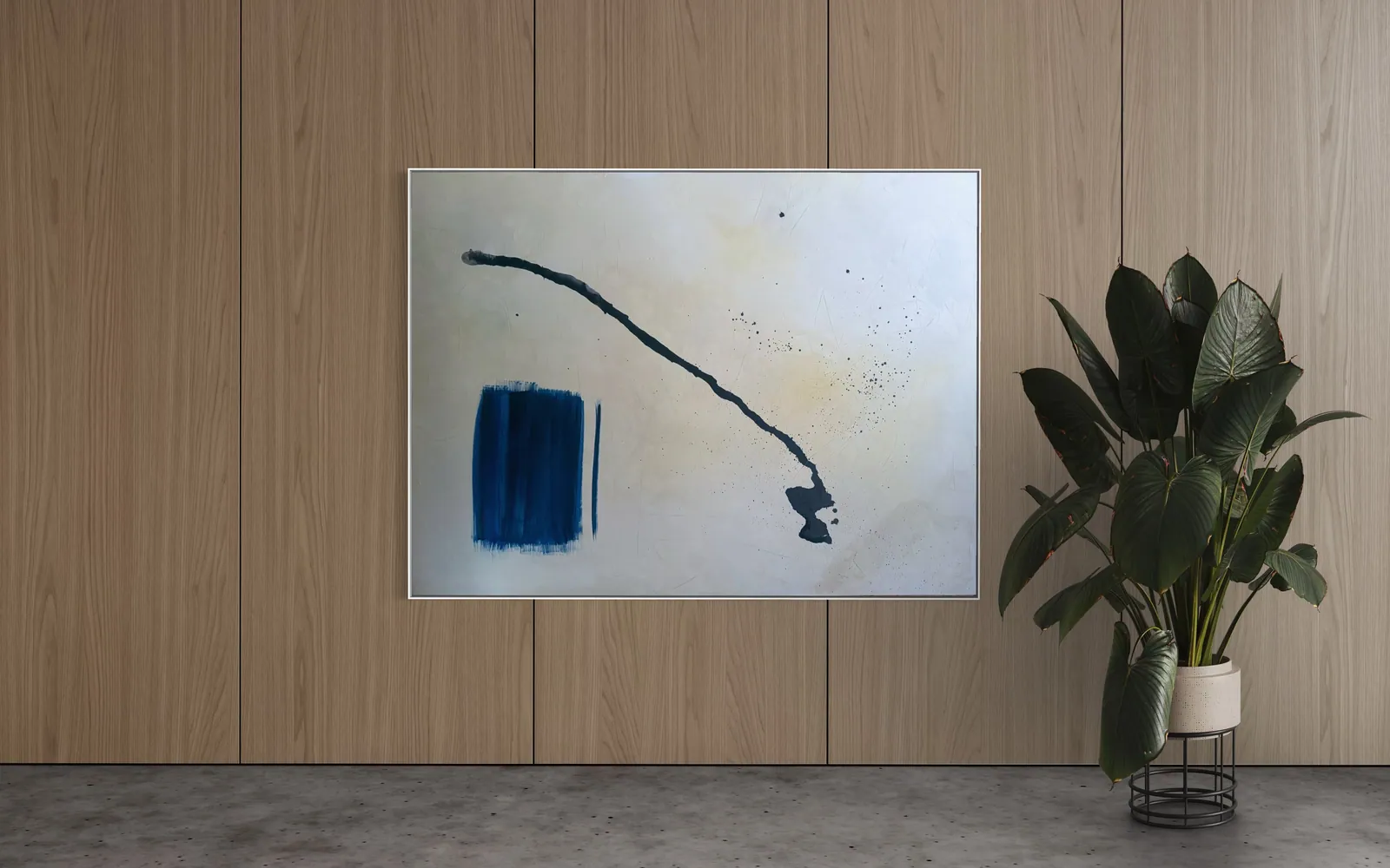
What tone actually works in a professional services office
A firm that handles other people's money has a narrower margin for visual risk than a hotel lobby or a private home. The work on the wall is read, consciously or not, as a signal about how the practice thinks — and the safest signal is restraint. Non-figurative, non-narrative work in a limited palette (warm neutrals, ink black, a single accent) tends to hold up across the widest range of clients, because it does not ask anyone to interpret a scene or agree with a message.
What to avoid is not any particular subject, but anything that pulls focus away from the conversation happening in the room: high-contrast pattern that vibrates at a distance, text-based or overtly political work, or anything so loud it becomes the thing clients remember instead of the meeting. A single strong, quiet piece per room reads as considered. Three competing pieces on the same wall read as unplanned.
Where it goes: reception, meeting room, and partner office are different problems
Reception is seen briefly, by everyone, usually while waiting — it can carry a bolder or larger piece because attention there is short and the room is rarely used for a sustained conversation. A meeting room is the opposite: the same piece is looked at, half-consciously, for the length of an entire engagement. Anything too busy or too warm-toned becomes fatiguing over a two-hour session; something calmer and more spacious tends to wear better across repeat meetings with the same client.
A partner's own office is the one space where a more personal or unusual choice is appropriate, since it is that partner's room and the piece can reflect their taste rather than the firm's collective one. The mistake firms most often make is buying one statement piece for the lobby and leaving every meeting room and partner office bare — the lobby is what a visitor photographs, but the meeting room is where they spend the appointment.
Setting a budget that does not turn into a line-item fight
Overspending on office art rarely comes from paying too much for one good piece. It comes from buying several mediocre pieces to fill several rooms at once, without a clear sense of which room matters most. A more workable approach is to rank the rooms by how much client time they actually absorb — typically the main meeting room first, reception second, individual offices last — and commit the bulk of the budget to the room at the top of that list, rather than splitting it evenly.
Buying directly from an artist's studio, rather than through a gallery markup or a decorative reproduction supplier, generally puts more of the budget into the actual piece rather than into distribution margin. It also means the firm can ask directly for documentation — a certificate of authenticity, dimensions, and an archive reference — which matters for the firm's own asset records, separate from any question of whether the purchase is tax-deductible (see the FAQ below).
Original work or a print for a professional office?
A print is the lower-cost, lower-risk choice for a space that will be redecorated often, or for a junior office where the firm does not want to commit capital. An original work carries a different weight: it is a single, non-reproducible object, it is the one the firm can point to as its own acquisition rather than a purchased reproduction, and it tends to read as more deliberate to clients who notice the difference between a print run and a signed, one-off piece.
For the rooms that carry the most client-facing weight — the main meeting room, the partner floor reception — an original piece, bought directly and documented, is generally the better fit for a firm building a considered visual identity rather than filling wall space.
From the studio
The view from the studio
Because I trained as an architect before I trained as a painter, I read a meeting room the same way I would read a floor plan — where the eye lands first, how long a person sits facing one wall, whether the light in the room is warm or cold at the hour most meetings actually happen. A corporate room is a harder brief than a living room: it has to hold up under fluorescent light, under video-call framing, and under repeated use by the same small group of people for years. That is exactly the condition my Matter & Silence series was built for — restraint instead of spectacle, a single gesture and a lot of quiet field around it, so the piece does its work without asking the room for attention it does not have to spare.
Frequently asked
What art works in an accounting firm?
Non-figurative, non-narrative work in a limited, calm palette tends to work best across the widest range of clients, because it does not require anyone to interpret a scene or take a position on a message. Abstract compositions with a restrained color range and a clear, uncluttered structure read as considered rather than decorative, and they hold up well under repeated viewing in a room used for the same kind of meeting over and over.
Can a company deduct art as a business expense?
This depends on the jurisdiction, the company's structure, and how the piece is booked on the company's own accounts, so it is not something a studio or gallery can answer in general terms. It is a question for the firm's own accountant or tax advisor before the purchase, not after. This is general information, not financial or legal advice.
What size fits a meeting room wall?
There is no fixed formula, because it depends on the wall's own dimensions, the distance from which it will typically be seen, and what else is already on that wall. The more reliable approach is to measure the specific wall and the seating distance in the room, rather than applying a generic size rule meant for a different kind of space. A studio that sells originals can usually advise on scale once it has those two measurements.
Should the art match the brand colors?
Matching is not the goal, and pieces chosen purely to echo a logo color can end up feeling like signage rather than art. A more durable approach is choosing a piece whose palette does not clash with the firm's existing materials and interiors, while letting the work stand as its own object rather than as a color accessory to the brand.
Original art or a print for a professional office?
A print is the lower-cost option for a space that will change often or for a junior office where the firm is not ready to commit capital. An original is a single, non-reproducible piece that the firm can document and point to as its own acquisition, which tends to matter more in the rooms that carry the most client-facing weight, such as the main meeting room or partner-floor reception.
Choosing a piece for your firm's meeting rooms
Alyne Perfeito works directly with firms selecting original art for reception and meeting spaces, with documentation included for the firm's own records.
Published on