Art for a law office: what signals authority without looking cold
Art for a law office works best when it signals permanence and judgment, not decoration — a single large, disciplined abstract piece in a controlled palette (charcoal, ink, terracotta, or black and gold) reads as authority; a wall of small framed prints reads as a waiting room. The reception carries the first impression and can hold more visual weight; partner offices should stay quieter, one work per wall, chosen to hold up under a long meeting rather than a quick glance.
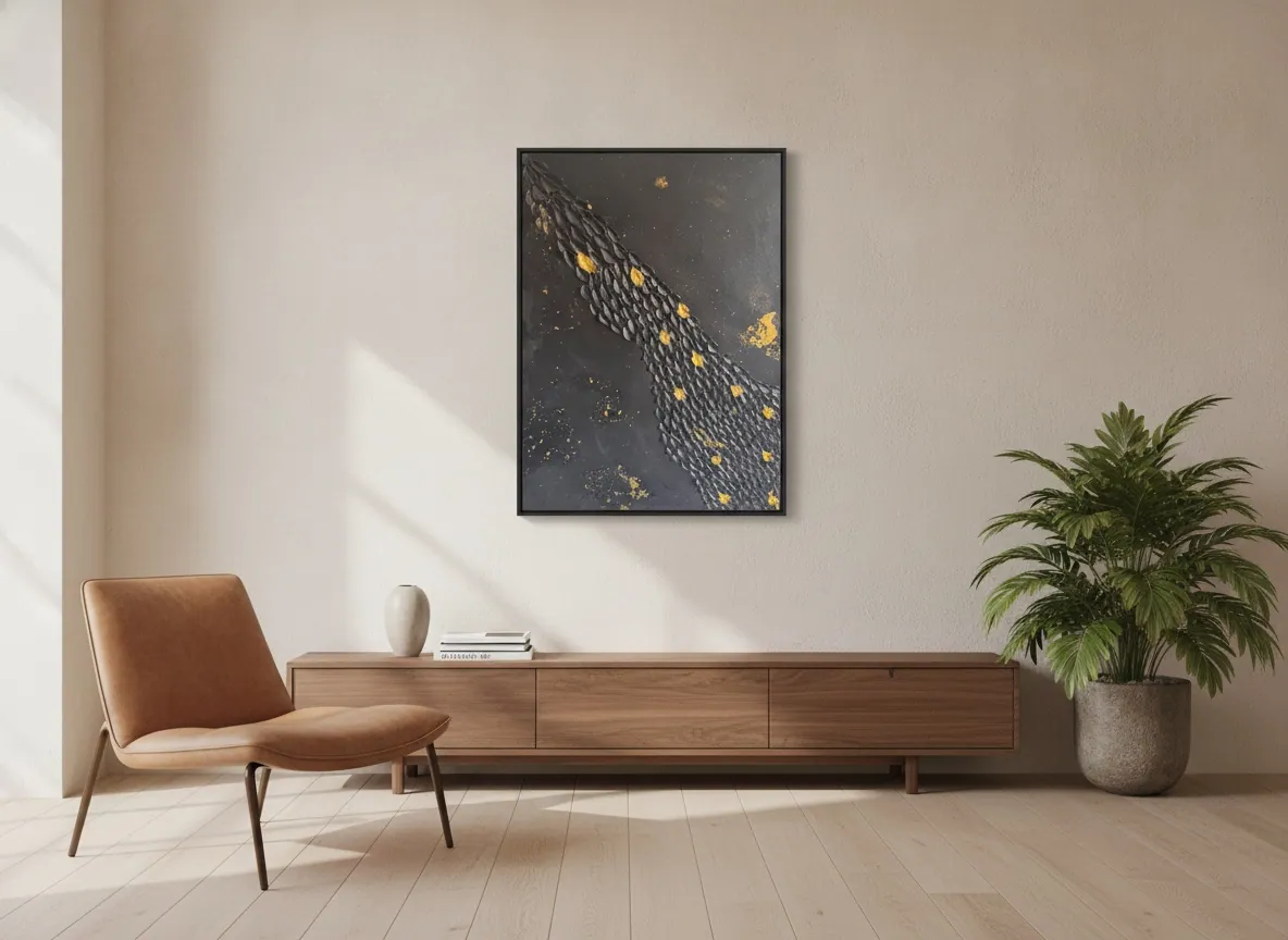
Why abstract art, and why it needs to be disciplined
A law office is a room where someone is asked to trust a stranger with something that matters to them — a contract, a dispute, a family situation. The art on the wall is read, consciously or not, as a signal about how the firm operates. Figurative art (a landscape, a portrait, a still life) tends to invite comment and personal taste, which is the wrong kind of attention in a room built for business. A disciplined abstract composition does the opposite: it holds visual weight without asking to be discussed, and it does not date the room the way a trend-driven print does.
“Disciplined” is the operative word. Abstract art that looks chaotic or unresolved reads as noise, and noise undermines the exact impression a law office is trying to build. What reads as authority is a piece with a clear internal structure — a dominant gesture, a controlled palette, visible technical intention — even when the surface itself is expressive or textured.
Palette: what colors actually read as authoritative
Charcoal, deep ink blue, terracotta, and black paired with metallic accents are the palettes that consistently read as serious rather than decorative. Black and gold in particular has a long association with permanence and formal record-keeping — it is common in settings that handle documents and official acts, from notary offices to bank lobbies — which is part of why it works in a law office without needing to try. Warm neutrals (terracotta, ochre, deep brown) do the same job with less contrast, for a firm that wants gravity without the formality of black and gold.
What to avoid: pastel ranges, high-saturation primary colors, and anything closer to a corporate motivational poster than a painting. Those read as generic office decor rather than a considered choice, and a considered choice is the entire point of putting original art in the room.
Original work or prints: the actual trade-off
A print costs less and is easier to replace, but it also signals exactly what it is — a decision made from a catalog rather than a decision made about that specific room. Clients and opposing counsel who spend time in professional-services offices generally can tell the difference at a glance: an original has visible texture, a signature, and a scale that was chosen for that wall, none of which a print reproduces convincingly at close range. For a reception or a managing partner's office — the rooms that carry the most weight — an original is the stronger signal for a modest cost difference relative to the space itself.
Where prints are a reasonable choice: secondary spaces — a hallway, a smaller associate office, a conference room used mainly internally. The rule of thumb is to spend the original-art budget on the one or two rooms a client actually sits in, and use reproductions or photography elsewhere.
Placement: reception versus partner offices
The reception is where a firm can afford to be bolder — a single large-scale piece, ideally the largest the wall comfortably holds, placed where it is the first thing a visitor's eye lands on after the front desk. This is the room doing the most work in the first ninety seconds of a client relationship, and a strong, confident composition earns its place there.
Partner and conference-room walls need a different register: quieter, smaller in visual noise even if not in physical size, and chosen to remain interesting without becoming distracting during a two-hour negotiation. One piece per wall, hung at a height that reads correctly to someone seated at a desk or a conference table — not eye height for someone standing, which is the most common placement mistake in professional offices.
Scale and sizing for a professional wall
Undersized art is the most common error in law offices: a small painting on a large wall looks like an afterthought regardless of quality. As a working rule, the piece should occupy roughly a third to two-thirds of the available wall width at eye level, with enough surrounding negative space that it does not compete with a diploma wall or shelving. A reception wall of 3–4 meters can comfortably hold a single work in the 120–150 cm range; a standard partner office wall usually calls for something closer to 80–100 cm.
From the studio
The ateliê's view
Because I trained as an architect before I trained as a painter, I read a law office the way I read a floor plan first — where the eye lands walking in, where a client sits for twenty minutes waiting, where a partner sits for two hours across a table. A piece that works in a portfolio photograph does not automatically work on that specific wall, at that specific distance, under that specific light. When a firm writes to the studio about outfitting a reception or a partner floor, the first questions are always about the room — wall width, ceiling height, where the light comes from — before any conversation about which piece. The Black & Gold and Terra & Ether series come up most often for this kind of space, simply because their palettes were built around exactly the sobriety a professional room asks for.
Frequently asked
What art fits a law office?
Disciplined abstract work in a controlled palette — charcoal, ink, terracotta, or black and gold — fits best. It signals permanence and judgment without inviting the kind of personal commentary that figurative art or busy patterns tend to draw in a professional setting.
Should a law firm buy original art or prints?
For the rooms that carry the most weight — reception and the managing partner's office — an original is worth the modest premium over a print, because clients and visitors can usually tell the difference at close range. Prints are a reasonable choice for secondary spaces like hallways or smaller internal offices.
What colors read as authoritative?
Charcoal, deep ink blue, terracotta, and black paired with metallic accents consistently read as serious. Black and gold in particular carries a long association with permanence and formal record-keeping. Pastels, bright primary colors, and generic “motivational poster” tones read as decor rather than a considered choice.
Where should the piece go — reception or partner offices?
Reception can hold the boldest, largest piece, since it does the most work in a visitor's first impression. Partner and conference-room walls need something quieter and less visually noisy — one work per wall, hung to read correctly from a seated position rather than standing eye height.
Does abstract art work better than figurative in this setting?
Generally yes. Figurative art (landscapes, portraits) invites personal opinion and comment, which is the wrong kind of attention in a room built for business. A disciplined abstract composition holds visual weight without asking to be discussed or dating the room.
Outfitting a law office reception or partner floor?
Send the wall dimensions and light direction — the studio will suggest pieces sized correctly for the room, with shipping and documentation for international delivery.
Published on