Art for a medical laboratory reception
A medical laboratory reception calls for abstract, low-contrast work in a neutral or muted palette — patients are often fasting, anxious about a blood draw, or simply in a hurry, so the room should read as calm rather than demand attention. Sculpted-texture or mixed-media pieces in soft neutrals hold up better under fluorescent lighting and frequent cleaning than glossy, high-saturation work, and a mid-size original (roughly 100–160 cm on the long side) reads clearly from the check-in desk without crowding a small waiting area.
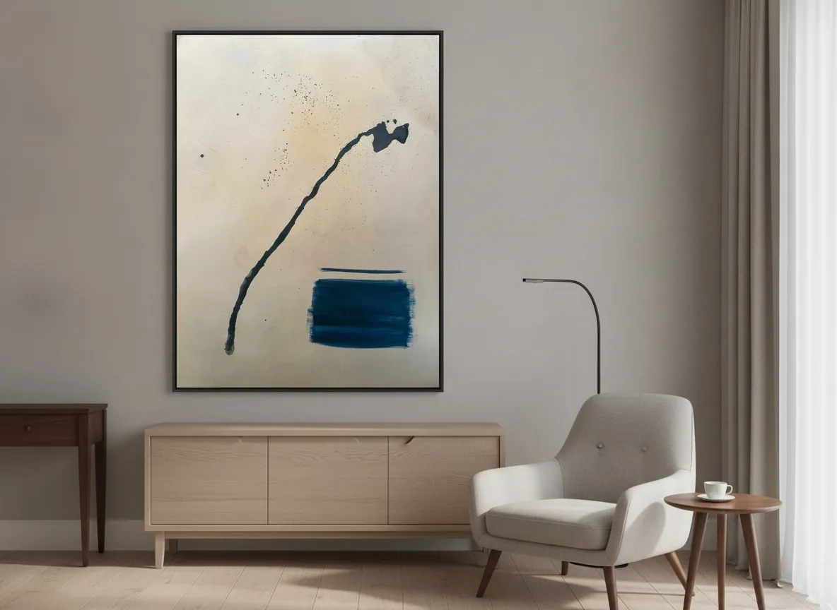
What actually works in a diagnostics lab reception
A laboratory reception is a transit space, not a lounge: most people are there for a blood draw, a swab, or to drop off a sample, and they are looking at the room for a few minutes at most, often on an empty stomach. The art that works here is abstract rather than figurative — no scenes that ask to be "read" or interpreted, no imagery that could be mistaken for anything clinical or bodily. Texture, layered color, and a sense of depth give the eye something to rest on without requiring attention. A single anchor piece behind or beside the check-in desk, sized to the wall rather than the smallest available frame, does more for the room than several small prints scattered across it.
Neutral or warm palette?
In the studio's experience placing work in clinical and administrative interiors, a neutral-to-warm palette outperforms a cool or saturated one in a lab setting. Diagnostic labs already lean cool — white counters, stainless steel, fluorescent light, blue-toned signage — so a piece built from warm neutrals (sand, bone, muted ochre, soft charcoal) reads as a deliberate counterpoint rather than more of the same. Cool blues and greens can visually merge with the clinical palette and disappear; a warm, textured piece stands out as art rather than as another surface in the room. This is a design preference the studio has observed in practice, not a clinical claim.
Original art or a print?
For a reception that patients see once and staff see every day, an original holds up better than a print in both material and experience. A print on paper or canvas transfer is a flat reproduction; an original mixed-media or sculpted-texture piece has real depth — ridges, layered pigment, sometimes metallic leaf — that changes slightly with the angle of the light throughout the day, which keeps a small, repetitive space from feeling static. A print is the practical choice only when budget or a very tight timeline rules out an original; it is not a substitute in feel, and the studio does not present either option as a financial investment.
Sizing a small reception area
A common mistake is choosing a piece too small for the wall it will occupy, which reads as an afterthought rather than a deliberate choice. For a compact reception, a single piece in the 100 x 100 cm to 120 x 160 cm range, centered on the main sightline from the entrance or the waiting seats, generally reads better than two or three smaller works competing for attention. If the wall is genuinely narrow, one vertical-format piece near eye level from a seated position works better than a low horizontal one that gets partially blocked by the counter.
Disinfection and daily cleaning
A laboratory reception is cleaned and disinfected more often than a typical office, and that is worth planning for. In the studio's practical experience, the main risk is not to the paint itself — sealed acrylic and mixed-media surfaces are reasonably stable — but to proximity: placing a piece where it could be splashed by cleaning solution, or hung low enough to be brushed by a mop or cart. The straightforward fix is positioning: hang the piece above counter height and away from any surface that gets wiped down directly, and avoid recessed or high-humidity corners near sinks. None of this requires special glazing for an acrylic or mixed-media piece kept at a normal distance from wet cleaning.
From the studio
The studio's view
Alyne trained as an architect before she trained as a painter, and it shows in how she thinks about a reception wall: not as a frame to fill, but as a surface the room's traffic will pass in front of dozens of times a day. The Matter & Silence series — sculpted texture built up in thin layers, kept to a narrow, quiet palette — came out of wanting pieces that hold a room's attention without raising its temperature. That is the brief a lab reception gives without saying it out loud: something calm enough not to compete with a nervous patient's morning, substantial enough not to disappear into the walls.
Frequently asked
What art fits a medical lab reception?
Abstract, texture-driven work in a neutral or muted palette fits best. Avoid figurative scenes, medical or bodily imagery, and anything with strong contrast or saturation that competes for attention in a space people pass through quickly, often while anxious or fasting for a test.
Should the palette be neutral or warm in a clinical lab?
Warm neutrals generally work better than cool tones. Labs are already visually cool — white surfaces, stainless steel, blue signage — so a warm-toned piece stands out as a deliberate design choice instead of blending into the clinical palette and losing its presence.
Does frequent disinfection damage original art?
Not typically, if the piece is placed sensibly. The practical risk is proximity to spray or wipe-down cleaning, not the paint film itself. Hang the piece above counter height and away from surfaces that get disinfected directly, and it should hold up under a normal daily cleaning routine.
What size for a small reception area?
One piece in the 100 x 100 cm to 120 x 160 cm range, centered on the main sightline from the entrance or waiting seats, usually reads better than several smaller pieces. Size the work to the wall, not to the smallest frame that will technically fit.
Original art or print for a diagnostics lab?
An original holds up better in daily use because it has real surface depth — texture and layered pigment that shift subtly with the light — which keeps a repetitive space from feeling flat. A print is a reasonable fallback under budget or time constraints, not an equivalent experience.
Choosing a piece for a clinical reception?
Share the wall's dimensions and lighting, and the studio can suggest which pieces fit the space.
Published on