Art for a dental clinic: what actually calms a waiting patient
A dental clinic calls for a cool, low-saturation palette (bone white, warm grey, restrained blue), a composition with no figurative scene, and a scale sized to how far the patient actually sits from the wall — a waiting-room piece and a treatment-room piece are rarely the same size. These are environment-design criteria, backed by clinical research on dental anxiety, not a matter of taste.
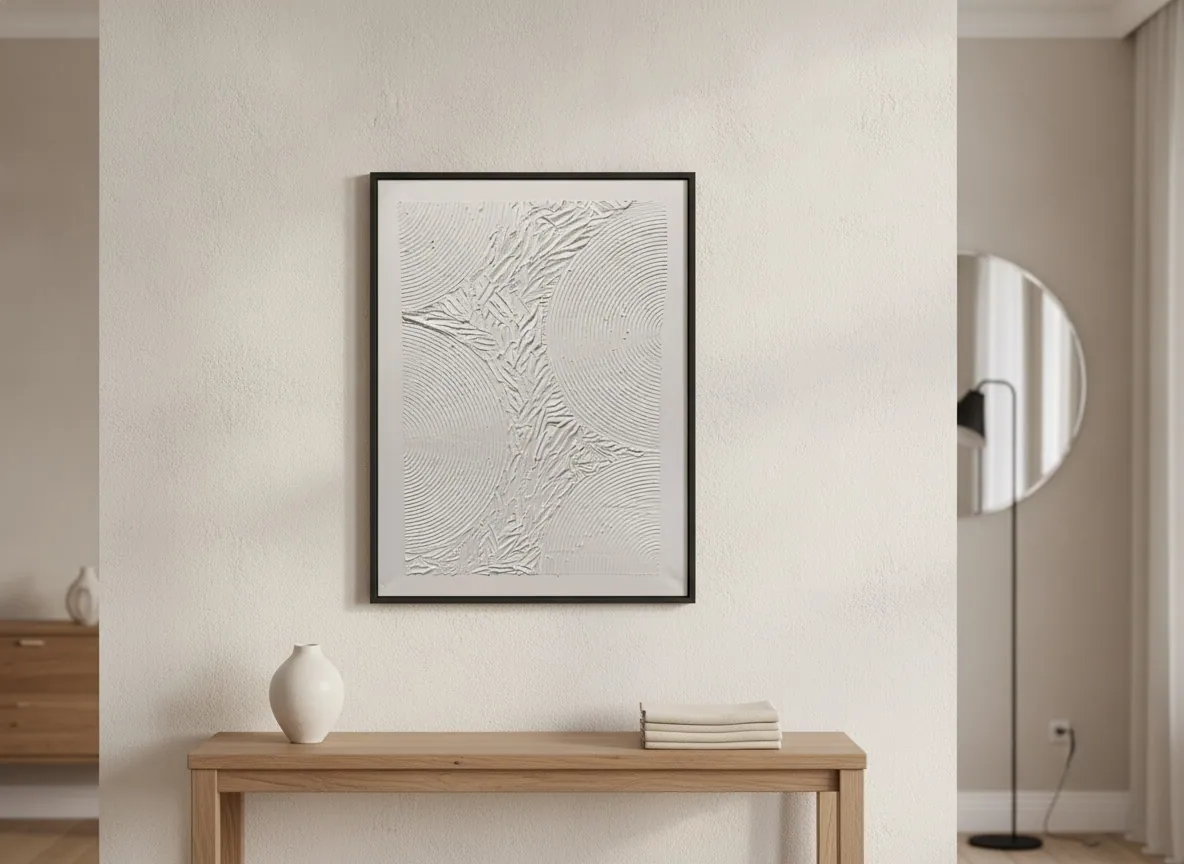
The palette that lowers tension before the chair
A 2025 clinical study with 20 patients diagnosed with dental phobia tested colored visual exposure -- translucent lenses in green, blue, and red, against a neutral translucent control -- right before procedures such as peripheral venous puncture. Green produced a statistically significant reduction in salivary alpha-amylase, a physiological stress marker, compared with the control, and both green and blue reduced perceived pain on the Visual Analog Scale compared with red and the control. Red alone showed no stress reduction on any measure.
That does not mean painting a wall green. It means cool, low-saturation tones have specific clinical backing for a dental setting, while red, orange, and other saturated warm colors do not. Bone white, light grey, and a contained blue -- the kind of deep blue block that anchors a piece like Silent Interval -- meet that criterion without reading as sterile or cold to the eye.
Waiting room and treatment room are not the same brief
The two spaces call for different pieces. In the waiting room, a patient views the work standing or seated, from a greater distance, often for several minutes at a time -- that is where a piece with more presence, such as Silent Interval (120 x 160 cm), holds up at a distance without competing with reception traffic. Inside the treatment room itself, the patient is reclined in the chair, the field of view is narrower, and free wall space is usually limited to the area above a cabinet or beside the light -- that calls for an entry-scale piece such as Echo of Silence (50 x 70 cm).
The practical rule: the work needs to read without the reclined patient turning their head, which is uncomfortable in that position. If the only available wall sits outside the chair's normal sightline, it is better to leave it bare than to force a placement.
Abstract or nature scene: what the evidence actually shows
A 2025 review of 25 experimental studies on art in healthcare settings -- waiting rooms, procedure rooms, and patient rooms -- found consistent, robust evidence for nature imagery specifically: reductions in stress, pain, and anxiety, and higher patient satisfaction, across contexts ranging from otolaryngology to colonoscopy. For other forms of visual art, including abstract work, the authors describe the results as "promising but inconsistent, requiring additional testing" -- the evidence base is thinner than it is for landscapes and nature scenes.
The same review cites survey data from more than 1,000 Cleveland Clinic patients, of whom 61% credited the hospital's art with reducing their own stress. The honest read: quality art in a clinical environment is associated with lower perceived stress, but abstract work does not yet carry the same volume of controlled study as nature imagery. That is why the studio recommends a sober abstract composition on environment-design grounds -- it avoids the figurative scene that pleases some patients and unsettles others -- rather than on a clinical promise the research does not yet support at that level of rigor.
Placement near the tray, the sink, and the traffic path
A dental treatment room has cart traffic, an instrument tray, and a sink nearby. In the studio's practice, the same logic applies here as in any clinical space: keep the piece out of the assistant's walking path and away from water or disinfectant splash, and never directly above or beside the basin. Drywall needs the right anchor and, depending on the piece's weight, internal wall reinforcement; concrete allows direct fixing. Ahead of delivery, the studio advises on the mounting point and hardware based on the piece's weight and the destination wall's material.
From the studio
The studio's view
Trained as an architect, I walk into a clinic and read the light first -- and clinical light is usually white, cold, and high-intensity, built for examination, not for color. It washes out warm tones and changes how a metallic pigment or a textured layer reads, compared with the warmer light of a home. That is why, when a dentist writes asking for a recommendation, I ask for a photo of the wall under its real lighting before suggesting a piece. Silent Interval came out of exactly that logic of restraint: a single dark gesture descending through a field of warm bone white, anchored by a block of blue -- it is not a piece that shouts, it is a piece that holds silence in a room that already has enough noise from a suction unit and a drill. Works in the Matter & Silence series were built for spaces that need calm without needing a subject.
Frequently asked
What art works best in a dental waiting room?
A sober abstract composition in a cool, low-saturation palette -- bone white, grey, a contained blue -- sized to be legible from where patients actually sit, which is usually farther away and for longer than in the treatment room itself. Nature imagery has the strongest clinical backing for reducing stress and anxiety in healthcare settings generally, but a calm abstract piece meets the same environment-design goal without a figurative scene that some patients read differently than others.
Should treatment rooms have art at all?
Yes, when the piece fits what a reclined patient can actually see. Free wall space in a treatment room is usually small -- above a cabinet or beside the light -- and the patient's field of view is narrower than in the waiting room, so an entry-scale piece placed within that sightline works better than a larger one that sits outside it. If the only free wall is outside the chair's normal view, it is better left bare than forced.
What colors reduce anxiety in a clinical setting?
A 2025 clinical study with patients diagnosed with dental phobia found that green significantly reduced a physiological stress marker (salivary alpha-amylase) before a procedure, and that both green and blue reduced perceived pain compared with red and a neutral control; red alone showed no stress reduction on any measure. That supports a cool, low-saturation palette -- bone white, grey, contained blue -- over warm, saturated colors like red or bright orange in a dental setting.
Can original art survive constant disinfection?
A finished mixed-media or acrylic piece on canvas is not being wiped down itself -- the risk is placement, not the surface. The studio's practice is to keep the work out of splash range from a sink or disinfectant spray and off the cart or foot-traffic path, rather than to treat the canvas as something that needs to withstand cleaning agents directly.
What size fits a small reception wall?
For a modest reception wall, an entry-scale piece in the 50 x 70 cm to 80 x 120 cm range is usually the right fit -- large enough to read from a seated distance, small enough not to overwhelm a compact wall. For a treatment room specifically, the smaller end of that range, positioned within the reclined patient's sightline, tends to work better than a larger piece.
An original work for your dental clinic
Send the dimensions of your waiting room and treatment room, and Alyne will recommend a piece and palette suited to clinical lighting. International shipping, documentation, and installation guidance are quoted on request -- direct from the artist's studio in Brasília, Brazil, no gallery in between.
Sources
- Takemura et al., Journal of Clinical Medicine (MDPI), 2025 — 2026-08-17
- Cardillo & Chatterjee, Buildings (MDPI), 2025 — 2026-08-17
Published on