Earth-tone and terracotta abstract art for a warm interior
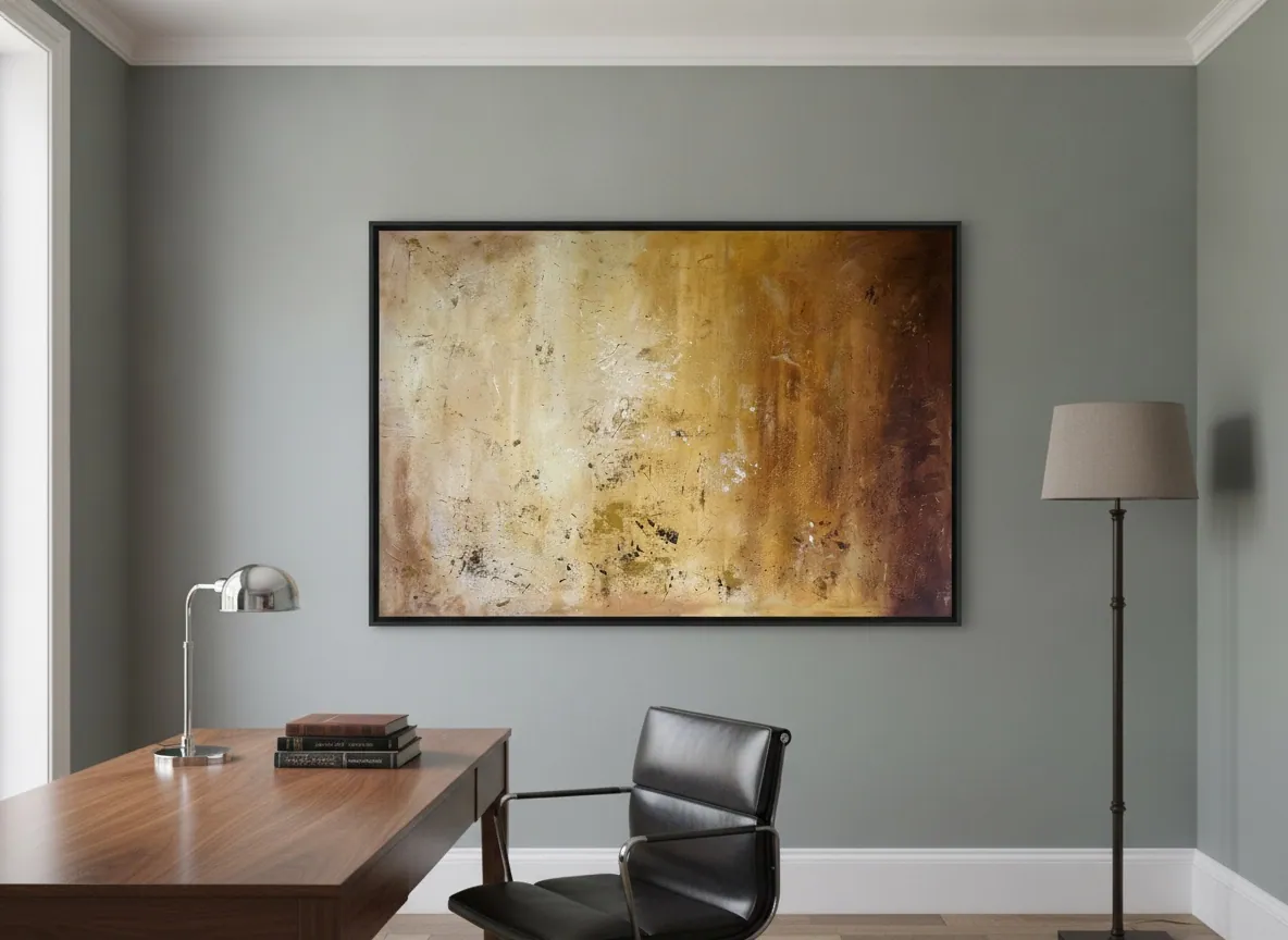
Earth-tone and terracotta abstract art reads as warm because the pigment sits in the ochre-to-umber range rather than a single flat brown — layered rust, bone, and burnt sienna instead of one uniform tone. The Terra & Ether series works this range directly, with paintings such as Amber Strata (ochre, bone, and oxidized umber) and Amethyst Ground (terracotta and ochre against violet and indigo) built in strata rather than blended flat.
What "earth-tone" means in a painting, beyond just brown
A single flat brown reads as dull on a wall; an earth-tone painting reads as warm. The difference is range and layering, not the base hue. In Amber Strata, Alyne Perfeito builds the surface from ochre, bone, and oxidized umber laid in horizontal passages, so the eye moves through several related warm tones rather than settling on one. Terracotta itself sits toward the orange-red end of that range — warmer and more saturated than a plain tan or khaki, which is why it reads as alive rather than neutral.
This is also what separates an earth-tone abstract painting from a beige or greige print bought to match a sofa. A print is usually one or two flat colors; a painted surface with real texture and tonal variation — pigment sitting thicker in some passages, thinner in others — catches light differently across the canvas, which is part of why it holds a room's attention instead of disappearing into the wall.
Terracotta abstract art in a minimalist room, not just a rustic one
Terracotta and other earth tones are often filed under "rustic" or "Mediterranean" decor, but the color range itself carries no style requirement — what places it is the composition around it. A minimalist interior with pale oak, linen, and unbroken wall space can hold a terracotta or ochre painting as the single warm accent in an otherwise cool, quiet room; the restraint of the space is what lets the color read as considered rather than decorative.
In a more layered, textured room — exposed brick, dark wood, woven textiles — the same painting reads differently: it blends into an established warm palette instead of standing apart from a cool one. Neither placement is more "correct." The question to ask before buying is which effect you want — an accent that draws the eye, or a piece that belongs to a palette you already have.
Wall colors that bring out an earth-tone painting
An earth-tone or terracotta painting generally needs contrast in value — lightness or darkness — rather than contrast in hue to read clearly. A warm white, pale bone, or light putty wall lets ochre and terracotta pigment stand forward without a fight for attention. A deep, cool wall — charcoal, forest green, navy — pushes the same painting into a more dramatic, gallery-like register, since the cool background makes every warm tone in the canvas read as brighter by comparison.
What tends not to work is a mid-tone warm wall in almost the same family as the painting — terracotta on terracotta, ochre on ochre — because the painting loses its edge against the wall instead of standing apart from it. If the wall and the painting share an undertone, look for a difference in lightness of at least a couple of shades before committing.
Do earth-tone paintings change in strong sunlight?
Any pigment shifts in appearance under different light — warm afternoon sun intensifies reds and oranges, while cool morning or overcast light mutes them, and this is simply how the eye reads color temperature, not something specific to earth tones. In the studio's own experience working with heavily textured mixed media on canvas, a piece placed where direct sun rakes across it through the day will visibly change character hour to hour — more so than a flat print would, because the texture itself catches and loses light.
That is a reason to think about a wall's actual light exposure before buying, not a warning against earth-tone work specifically. A photograph of the intended wall, taken at the time of day the room gets the most sun, is the most useful thing to send the studio before deciding on a piece and its placement — something the studio does for every international inquiry, regardless of the painting's palette.
Earth-tone versus black-and-white for a warm room
A black-and-white or grayscale abstract painting reads as graphic and cool — useful for a room that already has warmth in its materials (wood, leather, brass) and needs a sharper, more architectural counterpoint. An earth-tone or terracotta painting does the opposite: it adds warmth rather than balancing it, which makes it the stronger choice for a room that is already cool in its materials — white walls, pale stone, steel — and needs one element that feels lived-in rather than showroom-clean.
Neither is more versatile in the abstract; the choice depends on what the room already has too much or too little of. A useful test: stand in the room and note whether it currently feels warm or cold to the eye, then choose the painting that pulls it toward balance rather than doubling down on the tendency it already has.
From the studio
From the studio
Amber Strata started as a question about horizon lines, not about color. I wanted a canvas that read the way a cross-section of soil reads — ochre near the light, umber and rust further down, gold catching at the seams where one layer gave way to the next. The warmth came from the logic of sediment, not from a decision to "make something terracotta."
Trained as an architect, I still think about a painting the way I'd think about a material sample held up to a window — what does it do at 9am, what does it do at 4pm. Earth-tone work is the most light-sensitive palette I paint in, in exactly that sense: an ochre passage that looks quiet under gray morning light can turn genuinely hot by late afternoon. That's not a flaw to manage around — it's the reason I ask every collector for a photo of their actual wall before we go further.
Frequently asked
What makes a painting read as "earth-tone" rather than just brown?
Range and layering, not a single hue. An earth-tone painting moves through several related warm pigments — ochre, umber, bone, terracotta — built up in passages rather than mixed into one flat brown. That variation, plus real surface texture, is what keeps the color from reading as dull.
Does terracotta abstract art work in a minimalist interior, or only in rustic ones?
It works in both, for different reasons. In a minimalist room of pale wood and quiet walls, a terracotta painting stands out as the one deliberate warm accent. In a rustic or textured room, it blends into a palette that is already warm. The color itself is not the deciding factor — the rest of the room is.
What wall colour brings out an earth-tone painting the most?
Contrast in lightness matters more than contrast in hue. A warm white or pale putty wall lets the painting's ochre and terracotta read clearly, while a deep cool wall (charcoal, forest green, navy) sets it up as a dramatic focal point. A mid-tone wall close to the painting's own color tends to flatten both.
Do earth-tone paintings fade or shift in appearance in strong sunlight?
Any pigment reads differently under changing light — warm sun intensifies reds and oranges, cooler light mutes them — and in the studio's experience a heavily textured earth-tone surface shows that shift more visibly than a flat print does, since the relief itself catches light differently through the day. It is worth sharing a photo of the intended wall at its sunniest hour before choosing a piece and its exact placement.
How does an earth-tone painting compare to a black-and-white one for a warm room?
A black-and-white abstract adds a cool, architectural counterpoint — it works best in a room that already has warmth in its materials. An earth-tone or terracotta painting adds warmth instead, which suits a room that is currently cool in its materials and needs one element that feels grounded rather than sharp.
Send a photo of your wall
Alyne replies directly, in English or Portuguese, with close-up images of the actual canvas and how a specific piece reads in your room's light.
Published on