Blue and teal abstract art for a living room
Blue and teal-leaning abstract paintings do not automatically make a living room feel cold — the effect depends on the warmth of everything else in the room, especially the wood tones and the light. Paired with warm wood, cream textiles, or afternoon sun, a cool-toned painting reads as calm and grounded rather than chilly.
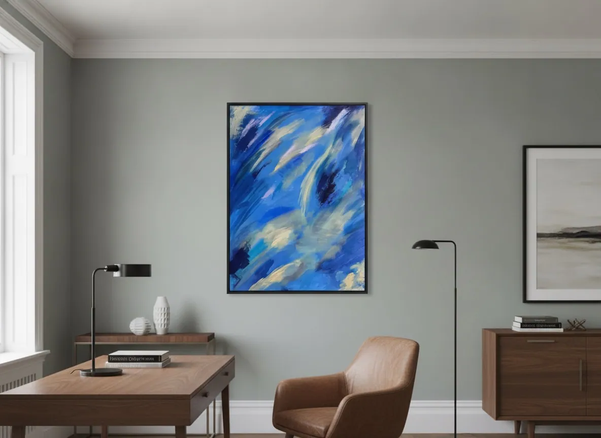
Cool color and the temperature of a room
Blue and teal sit at the cool end of the color wheel, and cool colors are often assumed to read as cold. In practice, temperature in a room is relative, not absolute — a blue or teal painting reads cool compared to whatever else is in the sightline, and a living room built from warm materials rarely tips into feeling cold because of one painting.
Wood flooring, leather or linen upholstery, brass fixtures, and warm-white lighting all carry their own temperature, and a cool-toned canvas sits inside that mix rather than overriding it. The paintings in Perfeito Studio's Luminous Rebirth series that lean blue, such as Celestial Drift, work pale yellow and ivory into the same composition — the cool tone is rarely used alone, even inside the painting itself.
Where a blue or teal painting genuinely tips a room cold is when the rest of the palette is also cool: gray stone floors, white walls, chrome fixtures, north-facing light. In that case the painting reinforces an existing cool tendency rather than causing it.
Pairing sofa and wall colour with a blue or teal painting
A blue or teal abstract painting is easiest to place against a neutral wall — warm white, soft gray, greige, or pale sand — because a neutral wall lets the painting's own gradient of blues and indigos, and any warmer accent inside it, read clearly instead of competing with a colored wall for attention.
- Neutral or warm-toned wall (cream, sand, warm gray): the safest pairing — it gives the cool palette somewhere to land without a clash.
- Sofa in leather, wood-toned linen, or rust and terracotta upholstery: the contrast between warm furniture and a cool painting tends to read as intentional and grounded, not accidental.
- Sofa already in blue, navy, or teal: workable, but the painting and the sofa should differ in value or saturation — matching them too closely flattens the room instead of layering it.
- Cool gray or pale blue wall behind a blue painting: the riskiest combination — without a warm anchor somewhere in the room (rug, wood, brass), the space can start to feel monochromatic rather than composed.
The reliable move is to let the room's warm materials — wood, brass, leather, a patterned rug — do the balancing, rather than trying to solve the temperature question with paint color alone.
Safe choice or risky one: where cool palettes go wrong
Blue is one of the most broadly liked colors in interior design, which makes a blue-toned abstract painting a comparatively safe choice — it rarely provokes the strong reactions that a saturated red or orange composition can. The risk is not that people dislike blue; it's that a cool palette with no warm counterweight in the room can read as flat rather than restful.
The safest version of this choice is a painting that, like Celestial Drift, carries more than one temperature within the same canvas — indigo and cerulean blues moving against ivory, pale yellow, or a warmer gray. That internal contrast does some of the balancing work before the painting even meets the room.
The genuinely risky version is a single flat field of cool color, hung in a room that is already cool in every other material choice. That combination is where "safe" tips into "cold" — not because of the color itself, but because nothing else in the room is left to counter it.
How daylight changes a blue painting through the day
Blue tends to shift more visibly across the day than warm colors, because blue pigment reflects the cooler light of morning and midday differently than it reflects the amber-heavy light of late afternoon. Under cool, north-facing daylight, a blue or teal painting tends to look crisp and saturated. Under the warmer, lower light of late afternoon, the same painting typically reads softer, with any yellow, cream, or gold within the composition becoming more visible.
This is a general tendency, not a fixed rule for every canvas or every room — the exact shift depends on the specific palette, the wall color reflecting light back onto the piece, and the direction the room faces. It's worth seeing a painting, or at least a detailed photograph of it, at more than one time of day before committing to a wall that gets strong directional light.
A room lit mostly by warm artificial light in the evening will consistently soften a blue-toned painting; a room that stays bright and cool well into the evening will keep it closer to its daytime read.
Teal against warm wood: does it clash?
Teal and warm wood is one of the more forgiving pairings in interior design, largely because wood tones sit in the amber-to-brown range, close to the opposite of teal on the color wheel — the two tend to read as complementary rather than competing. Walnut, oak, and other mid-to-dark woods tend to ground a teal or blue-green painting rather than clash with it.
Where the pairing can go wrong is scale, not color: a small teal painting on a large expanse of pale, blond wood can look under-scaled, while a large teal or blue painting against heavy dark wood paneling can tip a room toward feeling closed-in rather than warm. A mid-tone wood console, floor, or shelving unit, with the painting sized to the wall it occupies, is where this pairing tends to work most reliably.
None of the works currently in the collection are a pure teal. The collection's cool-toned pieces span a range, from the deep indigo-blue of Celestial Drift to the more teal-leaning blue-green of Veil of Light, and either sits comfortably within the warm-wood compatibility described here.
From the studio
From the studio
Blue is the color I return to most often when a client tells me the room already has too much going on — too much wood, too much pattern, too much decision already made. It's the color that asks the least of a space. When I mixed the blues in Celestial Drift, I kept working ivory and a pale warm yellow back into the canvas precisely so the painting wouldn't sit in the room as one flat temperature — a wall of pure cool blue can go quiet in a way that isn't restful, just absent.
As an architect before I was a painter, I still think about a blue canvas the way I'd think about glass or water in a floor plan: it opens the room rather than filling it. That's the opposite of what a saturated red or gold piece does, and it's why I'd rarely tell someone to match their blue painting to a blue sofa — the painting works harder when it's the one cool note in an otherwise warm room, not part of a matching set.
Frequently asked
Does a blue abstract painting make a living room feel colder?
Not on its own. A blue-toned painting reads cool relative to the rest of the room, but a living room built from warm materials — wood flooring, leather or linen upholstery, warm lighting — rarely feels cold because of one painting. The risk of a cold-feeling room comes from combining a cool painting with an already cool palette: gray stone, white walls, cool artificial light.
What sofa and wall colours pair well with a blue or teal abstract painting?
A neutral or warm wall — cream, sand, soft warm gray — is the safest background, since it lets the painting's own range of blues read clearly. For the sofa, warm materials such as leather, wood-toned linen, rust, or terracotta upholstery create a grounded contrast. A sofa that is already blue or teal can work, but it should differ from the painting in value or saturation so the two don't flatten into one note.
Is a blue-toned painting a safe choice, or does it risk looking too cool?
Blue is one of the most broadly liked colors in interior design, which makes it a comparatively safe choice. The risk isn't that people dislike blue — it's hanging a single flat field of cool color in a room with no warm counterweight anywhere else. A painting that carries more than one temperature within the same canvas, moving between blue and a warmer tone like ivory or pale yellow, does some of that balancing on its own.
How does natural light change the way a blue painting reads during the day?
Blue tends to shift more visibly across the day than warm colors. Under cool, north-facing daylight it typically looks crisp and saturated; under the warmer, lower light of late afternoon it usually reads softer, with any yellow or warm accents inside the painting becoming more visible. The exact shift depends on the specific palette and the room's light, so it's worth viewing a painting, or detailed photos of it, at more than one time of day before deciding on a wall.
Does a teal painting work with warm wood furniture, or does it clash?
Generally yes. Wood tones sit in the amber-to-brown range, close to the opposite of teal on the color wheel, so the two usually read as complementary rather than competing. The main risk is scale rather than color — a small teal painting against a large expanse of pale wood can look under-scaled, and a large teal painting against heavy dark wood paneling can make a room feel closed in. A mid-tone wood setting, with the painting sized to its wall, is the most reliable version of this pairing.
Not sure if blue is right for your room?
Send a photo of the wall and the light it gets, and we'll tell you honestly whether a cool-toned piece like Celestial Drift will work before you decide.
Published on