Does abstract art work in a pediatric clinic?
Yes — abstract art works well in a pediatric practice, and the deciding factor isn't style, abstract versus figurative, it's palette. A composition without one harsh point of high-contrast saturation tends to sit better in a room where adults and children spend real time than a wall of primary-color blocks. There is no consolidated scientific evidence that abstraction itself unsettles a young patient; the practical risk is visual noise, not the absence of a recognizable subject.
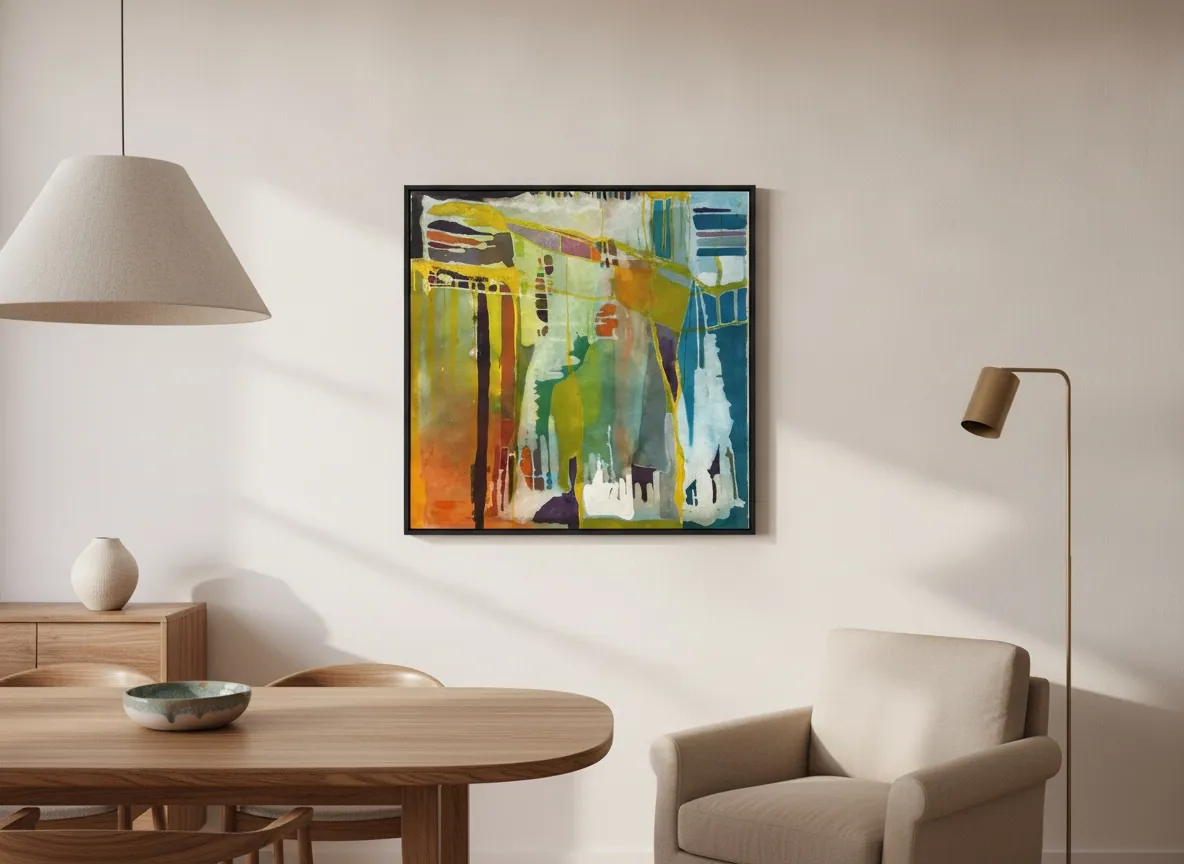
Does abstraction itself unsettle a child?
The worry is reasonable, but it usually points at the wrong variable. There is no consolidated scientific evidence that abstract art, as a style, agitates or frightens a young child — it is a debated area, not a settled finding. What does hold up as a practical rule of thumb, not a research conclusion, is that a composition without one dominant point of harsh, high-contrast color asks less of a small child's eye than a wall of saturated primary blocks — the kind of decor a clinic reaches for by reflex when the brief is "something for kids."
That reframes the question. The risk of visual fatigue in a waiting room sits in contrast and saturation, not in whether the work is figurative or abstract. A layered abstract composition, built in soft passages rather than flat blocks, tends to behave better as constant background in a room where people wait, and wait again, than a repeated figurative image rendered in pure primary color.
Should pediatric offices only use cartoon or children's art?
No — and the reflex to reach for cartoon murals or licensed-character prints usually solves the wrong problem. A pediatric reception is used far more hours per day by the adult who waits with the child, and by the staff who work the room every shift, than it is by any single young patient passing through. Designing only for a five-year-old's literal taste tends to produce a room that reads as generic and tires the adults who actually spend the most cumulative time in it.
A composition that rewards a second look — one with depth and layering rather than a single flat illustration — tends to hold up better across hundreds of repeat visits than an image built to please a child on first glance alone. Prism Garden, from the Luminous Rebirth series, is one example from the studio's catalog: lime green and citrine pool at the center, a field of petroleum blue gathers at the edge, and the transition between them happens in translucent layers rather than blocks — the kind of build that sustains attention without fatiguing it.
What colors work best for a young audience?
Welcoming color is not the same as vivid color. The common mistake in a space for children is to equate "kid-friendly" with saturated primaries — pure red, blue and yellow in large flat blocks — which tends to produce the opposite of the intended effect: a visually tiring environment for anyone who spends hours in it, child or staff. A warmer or luminous palette built in layered transitions, rather than isolated blocks of pure color, tends to sustain attention better over repeat visits than either extreme — overly vivid or overly neutral.
What size, and how high, for a small waiting room?
Scale should answer to the wall, not to the audience's age. For a small reception, a single piece sized to the wall's proportion, rather than an undersized print floating in too much blank space, tends to read as more intentional. On hanging height, a widely cited framing-industry guideline recommends centering the artwork 57 to 62 inches (about 145 to 157 cm) from the floor, using the higher end of that range in spaces where people mostly stand and pass through — a reception desk or corridor — and the lower end where people sit for a stretch of time, closer to an exam room during a consultation. The rule doesn't change because the audience includes children; it changes with whether the room is a standing space or a seated one.
Beyond height, safe wall fixation matters more in a high-traffic reception than the choice of image itself. Perfeito Studio provides installation guidance on request for any acquisition — this is a studio-side service, not a substitute for a wall professional's own judgment on a specific wall.
From the studio
The studio's view
When the request is "a piece for a pediatric practice," the first question we ask here isn't about style — it's about who actually spends the most time looking at that wall. It is rarely the child, who is usually absorbed in something else; it's the adult waiting with them, or the staff working the room every day. We design for that adult audience too, which in practice steers the choice away from the infantilized figurative cliché and toward a composition that can be seen many times over without tiring — the same criterion we apply to any space of prolonged, repeat use, whether it's a clinic, an office or a waiting room.
Frequently asked
Does abstract art work in a pediatric clinic?
Yes. The deciding factor is palette, not style. There is no consolidated scientific evidence that abstraction itself unsettles a young patient; the practical risk sits in high contrast and heavy saturation, which can tire anyone looking at the wall for hours, not in whether the image is abstract or figurative. A layered, softly transitioning composition tends to hold up better across repeat visits than a wall of primary-color blocks.
Should pediatric offices only use cartoon or children's art?
No. A pediatric reception is used more hours per day by the waiting adult and the clinical staff than by any single child passing through, so designing purely for a child's first-glance taste tends to produce a room that reads as generic and tires the adults who spend the most cumulative time there. A composition with depth, built to reward a second look, generally sustains attention across hundreds of repeat visits better than a single flat illustration.
What colors work best for a young audience?
Welcoming color, not necessarily vivid color. The common mistake is equating "kid-friendly" with saturated primaries in large flat blocks, which tends to tire anyone spending real time in the room. A warmer or luminous palette built in layered transitions — rather than isolated blocks of pure color — tends to sustain attention over repeat visits better than either extreme, overly vivid or overly neutral.
What size for a small waiting room?
Size the piece to the wall's proportion rather than to the room's audience. A single work sized to fill the intended space reads as more intentional than an undersized print with too much blank wall around it. Perfeito Studio can suggest scale from the catalog once the wall's dimensions and the room's function — reception versus exam room — are shared over WhatsApp.
Original art or murals for a pediatric practice?
Each has a different trade-off. A mural is fixed to that specific wall and cannot travel if the practice relocates or the space is redesigned; an original painting on canvas is portable, can be reframed within the room over time, and carries a resale and archival value a painted mural does not. For a practice that expects to move, renovate, or simply rotate its walls over the years, an original piece keeps that flexibility.
Choosing art for a pediatric practice?
Tell us the wall size and the room's mood — reception or exam room — and we'll reply with suggestions from the catalog on WhatsApp.
Sources
- Tribeca Printworks — 2026-09-27
- Perfeito Studio — studio catalog (src/data/obras.json) — 2026-09-27
Published on