Journal · Technique & materials
What is a limited color palette in painting?
A limited color palette is the deliberate choice to build a painting from only a few colors — often two or three, plus black and white — rather than the full spectrum. It is not a lack of skill: painters use it to control value, unify a composition, and let restraint itself carry meaning.
What a limited color palette actually means
A limited color palette means committing, before the first brushstroke, to a small working set of colors — often two to four, plus black and/or white — and mixing every intermediate tone from that set rather than reaching for a new tube of paint for each need. The technique has a long lineage in Western painting: the Swedish painter Anders Zorn is widely cited for working much of his career from a palette of only four colors — white, yellow ochre, cadmium red, and ivory black — and still achieving a wide tonal range through mixture alone.
What unites every version of the approach is restraint by design, not by accident. The colors that do appear in the finished work are the product of deliberate mixing decisions, not a default response to "what color is this object."
Why artists choose to work with very few colors
The most commonly cited reason is color harmony. When every hue in a painting is descended from the same small family of pigments, the colors share an underlying relationship that a full, unrelated palette does not produce as easily — the eye reads the composition as belonging together, even across sharp contrasts.
- Value takes over from hue. With fewer colors on the palette, an artist is pushed to resolve the composition through light and dark first, and color second — the structural decision that carries most of a painting's depth before color even enters.
- Fewer decisions, more control. Reducing the number of available colors reduces the number of choices made mid-painting, freeing attention for gesture, texture, and composition.
- Discipline over material. Working from a small set of base colors, rather than dozens of ready-made tints, also simplifies what the studio needs to keep on hand.
Is a limited palette a sign of simplicity, or a harder discipline?
It reads as simple; it is not. Restricting the palette is a deliberate decision, not a technical shortcut — it demands more control over mixing, not less, because every intermediate tone has to be built from a handful of ingredients instead of taken off the shelf. That is precisely why the approach recurs among technically advanced painters, Zorn among them, rather than functioning as a beginner's device.
Building depth without adding a new color
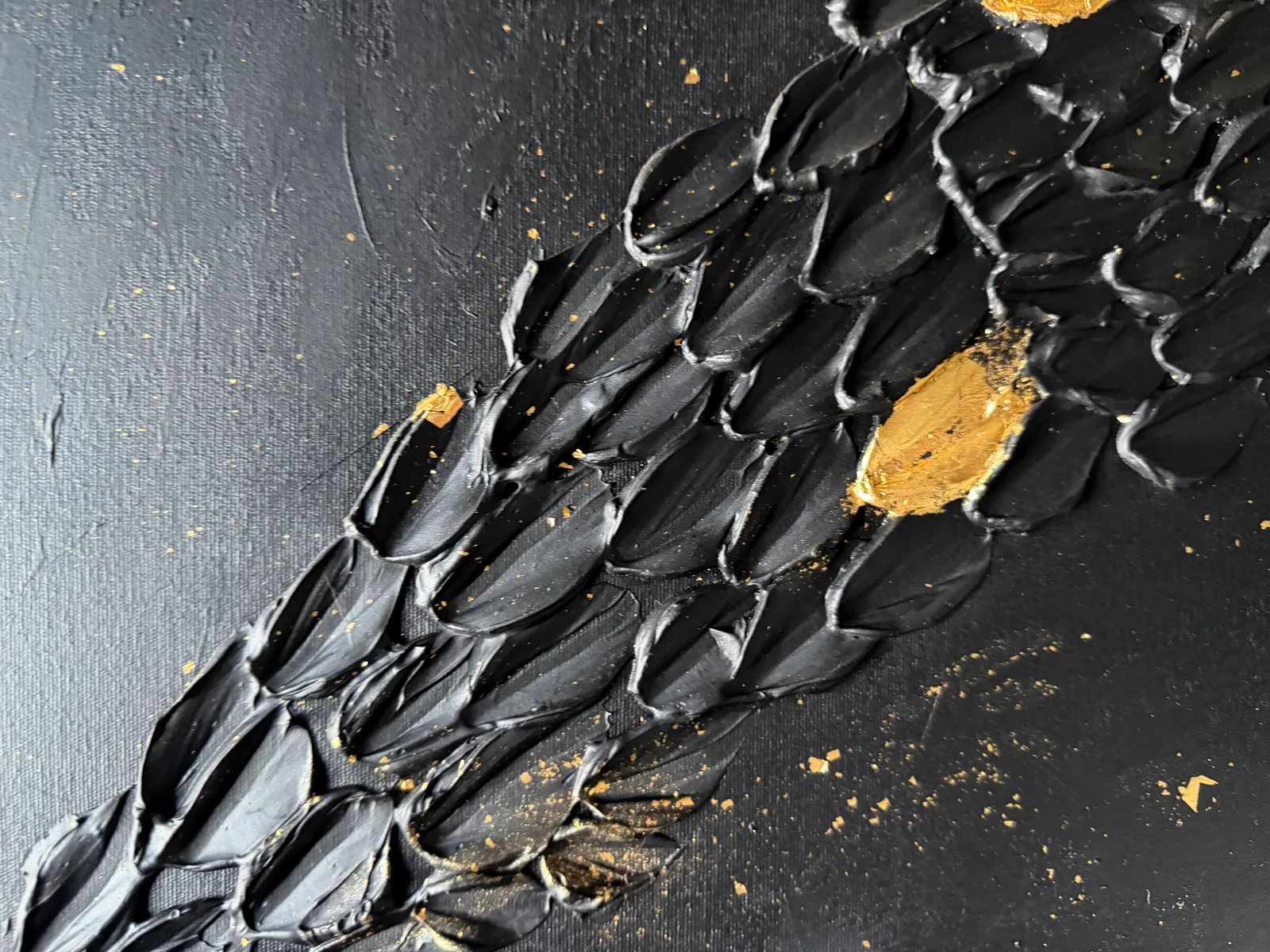
Without a fresh hue to mark every plane, a restricted palette creates depth through other means: value shifts (the same color lighter or darker), changes in saturation, physical texture on the surface, and — in mixed-media work — the way light behaves on a material itself. Gold leaf or metallic pigment changes appearance with the viewing angle without a single new color entering the composition.
That last strategy — light acting on material rather than color acting on color — is where the logic shows most clearly inside the Perfeito Studio collection: the Black & Gold series, built almost entirely from black and gold leaf.
Acquiring a limited-palette work — documentation and international shipping
Every piece in the collection is acquired directly from the artist's studio, with no gallery intermediary or resale markup. Each acquisition includes a signed Certificate of Authenticity, an internal Archive ID, the artist's dossier, and a fiscal invoice or receipt — the paper trail collectors and interior architects typically ask for before committing a piece to a serious space.
Pricing is set in Brazilian reais (BRL); international collectors can request an approximate USD or EUR reference on inquiry, and international shipping is quoted per destination with professional packaging included. Contemporary Brazilian art acquired this way — direct, documented, unfiltered by a gallery's program — is part of what makes the studio's collection legible to a buyer outside Brazil.
From the studio
The studio's view: why Black & Gold holds the palette
Celestial Plan (50 × 70 cm) is where the discipline shows most clearly: fine concentric ripples move across the black surface, and gold leaf breaks that field only in scattered points, the way stars sit against a night sky — present, never crowding the composition. Two colors, and nothing asks for a third.
Golden Passage (60 × 80 cm) uses the same two colors toward a different end. There is a diagonal current running through it — sculpted ridges that read almost like seed rows or a mineral seam — and gold only surfaces where that current breaks, marking a passage rather than decorating a surface. Neither piece treats gold as ornament. Black is the space the eye moves through; gold is what the eye is allowed to find inside it, sparingly enough that it still means something when it appears. That, more than any economy of materials, is the real argument for holding a palette this tight.
Frequently asked
What does a limited color palette mean in painting?
It means the artist commits to a small, fixed set of colors — often two to four hues plus black and/or white — and builds every tone in the painting by mixing within that set, instead of using a separate ready-made color for each need.
Is a limited palette a sign of simplicity or a deliberate technique?
It is a deliberate technique, not a shortcut. Restricting the available colors demands more control over mixing, since every intermediate tone must be built from a handful of pigments rather than taken directly from the tube — which is why the approach is common among advanced painters, not beginners.
Why do artists choose to work with very few colors?
Mainly for color harmony: hues that share the same small set of pigments tend to read as unified in a way a full, unrelated palette does not achieve as easily. Restriction also forces a focus on value (light and dark) over hue, and reduces the number of decisions made mid-painting.
Does a limited palette make it harder to create depth in a piece?
Not necessarily — it changes the method. Instead of introducing a new color for each plane, depth comes from shifting value and saturation, working the physical texture of the surface, and, in mixed-media work, letting light behave differently on a material like gold leaf as the viewing angle changes.
How can you spot a limited palette just by looking at a painting?
The clearest sign is a sense of cohesion — the colors read as part of the same tonal family, without sharp jumps between unrelated hues sitting side by side. Compositions built around two dominant colors, such as black and gold, are usually the most immediately visible examples.
Sources
- Draw Paint Academy — 2026-08-20
See the Black & Gold palette in person
Golden Passage and Celestial Plan work the same logic of black, gold, and restraint described here, at architectural scale. Message the studio on WhatsApp for details, current availability, and an international shipping quote — acquisitions are made directly with the artist, with a signed Certificate of Authenticity and Archive ID for every piece.
Talk to the studio on WhatsApp
Published on