Gold and black abstract art: what it signals in a room
Gold and black abstract art reads as luxury, drama, and formal elegance — the near-total contrast signals a deliberate hand, not decoration by default. In Alyne Perfeito's Black & Gold works, sparse fragments of gold leaf over a deep black ground keep that formality from tipping into excess, better suited to a focal wall than a busy one.
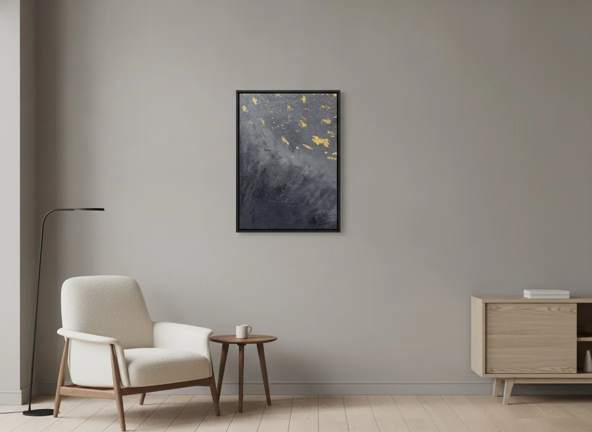
What the black-and-gold palette communicates in a room
Black and gold read as one of the most legible color signals in a room — most people register luxury and formality before they register anything else about the piece. Interior designers describe the pairing as accelerating "impact and attitude" precisely because it works through maximum contrast rather than harmony: black recedes, gold advances, and the eye reads that tension as deliberate rather than accidental.
The pairing shows up most often in entrance halls, dining rooms, and formal living rooms — spaces built around a single clear focal point — rather than in rooms with a lot of competing pattern or clutter.
How the gold actually reads under changing light
Genuine gold leaf behaves differently from gold-toned paint because of how it sits on the surface. Paint suspends reflective particles in pigment and diffuses the light that hits it; leaf forms a single continuous metallic skin, so light bounces off it more directly. The practical result is that a gold leaf painting is not visually static — its brightness and warmth shift with the angle a viewer stands at, the direction the light comes from, and the time of day.
In soft morning light, gold fragments tend to read warm and quiet, closer to a glow than a shine. In direct afternoon light or under a spotlight, the same fragments can flare into sharper, more pronounced highlights. This is normal, expected behavior for genuine leaf — not a flaw, and not something a photograph captures reliably, since a photograph freezes one instant of reflection. Anyone deciding where to hang a gold and black piece should think about how the wall's light changes over the course of a day, not just what the room looks like at the moment of the decision.
Where it works in a home — and where restraint matters
The rooms where gold and black do the most work are the ones built for a single strong focal point: an entrance hall that sets the tone on arrival, a dining room meant for evening light, a formal living room. It depends on a wall with real negative space around it — gold and black compete with other pattern and clutter more than most palettes do.
The main risk is overuse rather than the colors themselves. Design guidance on the pairing is specific about this: gold works best in restrained fragments or accents rather than covering broad areas, since too much gold pushes the look toward showy rather than considered, and too much unbroken black can make a room feel smaller and heavier than intended. Matte black paired with sparing, textured gold reads as modern.
Whether a gold-toned work holds up over time
The honest answer depends on whether the gold is genuine leaf or an imitation. Pure gold is a noble metal and effectively immune to corrosion; the high-karat leaf commonly used in painting — roughly 23 to 23.75 karat, alloyed with a small amount of silver or copper — keeps most of that resistance and is rated to hold its finish outdoors for 30 years or more. Indoors, away from weather entirely, genuine leaf is even more stable.
Imitation or “composition” leaf, made from brass rather than gold, ages the opposite way: even sealed with a protective coat, it commonly develops a dull, greenish haze within a few years. The two can look identical on the day a painting is finished, which is exactly why it's worth asking a studio directly what karat and type of leaf was used before treating a gold-toned piece as something that will hold its character for decades.
From the studio
In the studio: why the gold stays sparse
In both Celestial Plan and Golden Passage, I keep the gold down to scattered fragments over a black ground rather than letting it spread into a field. That choice is about the room as much as the canvas: a wall of gold reads as ornament, but a few decisive marks against black read as restraint — and restraint is what lets a piece sit well in a real room instead of announcing itself the moment someone walks in. When collectors ask about either work, the first question is almost always about the room's light, not its color scheme, which tells me people already sense that the gold is going to move once it's on their wall.
Frequently asked
What does gold and black abstract art usually signal in interior design?
Black and gold together read as luxury, drama, and confidence rather than decoration for its own sake — design writers describe the contrast as accelerating “impact and attitude” in a space, and the pairing as warm and rich even though black itself is a cool, receding tone. Because the eye reads maximum contrast as intentional, a black ground with gold marks tends to signal a deliberate choice rather than a safe, default one — which is why the combination shows up most in entrance halls, dining rooms, and formal living spaces rather than casual corners.
Does gold leaf in a painting read as gold in every lighting condition?
No. Genuine gold leaf forms a continuous metallic surface, so it reflects light directly rather than diffusing it the way paint does — its appearance changes with the angle of view, the direction of the light, and the time of day. In soft morning light it typically reads warm and quiet; in direct afternoon light the same fragments can flare into sharper, brighter highlights. That shifting quality is part of what genuine gold leaf offers over metallic paint, which stays visually flat regardless of where the light comes from.
What rooms work best for a gold and black abstract painting?
Rooms built for presence rather than everyday clutter: entrance halls, dining rooms, formal living rooms, and home offices, where the eye has a clear, uninterrupted view of the wall. The combination works across classical, contemporary, and eclectic interiors, but it needs a wall with enough negative space around it — gold and black compete with pattern, clutter, and other focal points more than most palettes do. A single piece on an otherwise quiet wall reads as intentional; the same piece surrounded by other strong colors or textures gets lost in the noise.
Is gold and black abstract art too formal for a casual living room?
Not inherently, but it depends on how much of each color is present and how it's finished. Design guidance on the pairing warns that overdoing gold specifically — covering large areas rather than using it in restrained fragments or accents — risks a look closer to a nightclub than a home. Matte black grounds with sparing, textured gold read as modern rather than formal; a flatter, more evenly gilded surface reads more ceremonial. A painting like Celestial Plan or Golden Passage, where gold appears as scattered fragments rather than a solid field, sits closer to the casual end of that range.
How does a gold-toned painting age compared to other finishes?
If the gold is genuine leaf, very well — pure gold resists corrosion, and the high-karat leaf typically used in painting (around 23 to 23.75 karat) is rated to hold its finish for 30 years or more, even outdoors. Imitation or “composition” leaf, made from brass rather than gold, is the opposite case: it oxidizes over time and commonly develops a dull, greenish haze within a few years, even when sealed with a protective coat. The distinction is worth asking about directly, since both can look identical when a painting is new.
See how the gold reads in your space
Celestial Plan and Golden Passage both use gold leaf in scattered fragments over black. Send a photo of the wall and a note on its light — morning, afternoon, or mostly artificial — and the studio can walk you through how each piece will read there.
Sources
- LuxDeco — The Luxurist — 2026-09-24
- Luxe Wall Art by Lisa — 2026-09-24
- Luxury Splash of Art — 2026-09-24
- GildedPlanet — 2026-09-24
- John Canning & Co. — 2026-09-24
Published on