Black and white abstract painting: what to look for before you buy one
Judge a black-and-white abstract painting on four things: its tonal range (true blacks against warm or cool whites, not flat print-black), the quality of the mark, physical surface texture, and whether it comes with the documentation to prove it is an original. Without color to hide behind, a weak composition shows immediately.
Tonal range: why the strongest black-and-white work isn't flat black and flat white
The paintings that hold up as black-and-white abstraction rarely use a single flat black and a single flat white. They use a range — near-blacks that shift warm or cool depending on the light, whites that carry a trace of bone, blue or grey, and every gradation the artist chose to keep or cut between them. The French painter Pierre Soulages, who worked almost exclusively in black for six decades until his death in 2022 at age 102, called this approach 'l'outre-noir' — black treated not as an absence of color but as a surface that reflects and redirects light, so the same passage of paint can look matte in one spot and luminous in another.
Kazimir Malevich's Black Square, painted in 1915 and now held at the Tretyakov Gallery in Moscow, is the historical reference point that made this kind of reduction a serious language rather than a decorative shortcut — its black surface has visibly cracked and shifted tone over more than a century, which is itself part of what scholars study in the work. The lesson for a buyer is practical: when you look closely at a black-and-white or near-monochrome painting, the black should not read as one identical value everywhere. If it does under every light you try, you may be looking at a flat print rather than a built, considered surface.
The quality of the mark: gesture, edge, and repetition
Once color is off the table, the way a mark was made carries most of the weight. Look at whether a stroke or line reads as a single decisive movement or as something built up, corrected, and gone over — both can be legitimate choices, but a painting that pretends spontaneity while actually being labored over in a way that looks uncertain rarely holds up under close viewing. Look too at the edge of each mark: is it a hard, masked line with no bleed, or does the paint feather naturally into the ground? Neither is automatically better, but the edge should match the logic of the rest of the piece.
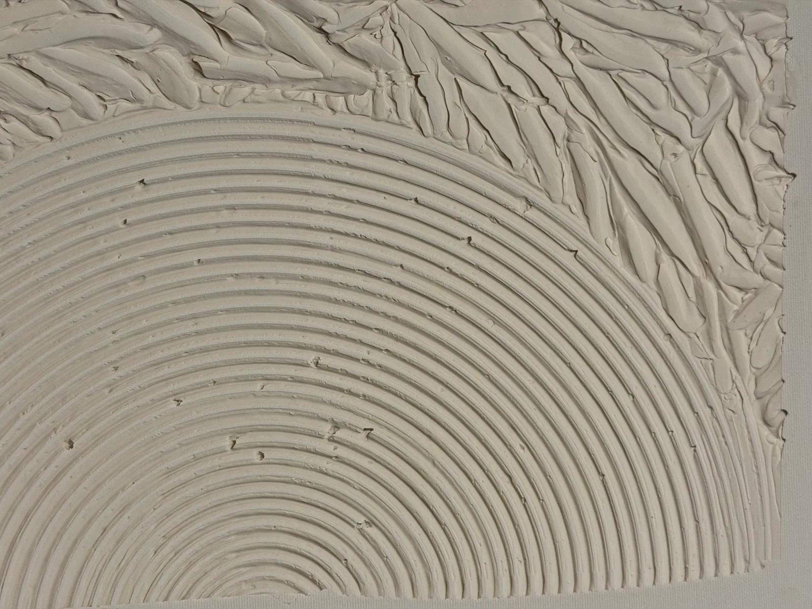
Repetition is worth studying on its own. A number of strong reduced-palette works build their structure from a repeated gesture rather than a single one — concentric rings, parallel passes, a grid of marks. In the atelier's own Matter & Silence series, Echo of Silence is built this way: a field of sculpted concentric relief in warm bone tones, not black and white, but evaluated by exactly this criterion — is the repetition steady and controlled from edge to edge, or does it wobble and lose discipline partway through the canvas. That consistency, checked up close, is one of the more reliable tells for whether a piece was made with real attention or assembled quickly to fill a wall.
Surface and texture: what a flat photo can't tell you
With no color to carry visual interest, texture frequently does that job instead — impasto ridges, scraped-back layers, sculpted paste, metallic pigment catching light at an angle. None of this is visible in a straight-on catalog photo shot under even studio light, which is exactly why it is worth asking. A useful request to any seller: a short video of the actual canvas with the light raking across the surface at a low angle, ideally from more than one direction.
What you're checking for is whether the relief is physical paint sitting proud of the canvas, with the shadows and highlights shifting as the light angle changes, or a flat surface with a printed or embossed illusion of texture that looks identical from every angle. Real built-up paint will show small inconsistencies — a slightly heavier ridge here, a thinner pass there — because it was made by hand, one pass at a time, rather than reproduced from a single file.
Scale and how a reduced palette holds a wall
A small monochrome or near-monochrome piece can read as a study — interesting up close, but easily lost on a large wall where color-heavy work would carry the room instead. The same restraint, at a larger format, tends to read as architecture: the eye has enough surface to travel across, and the absence of color becomes a deliberate statement about the room rather than a gap in it. This is one reason the atelier's own Black & Gold series works the way it does — a black field, kept mostly bare, with gold leaf appearing only at specific points, built at sizes meant to anchor a wall rather than sit on it.
Before committing to a size, photograph the actual wall at the hours you'll most often see it, and hold a piece of paper or tape at the intended dimensions on that wall. A black-and-white or reduced-palette painting is more sensitive to this test than a colorful one, because it has less to compensate with if the scale is wrong.
Documentation: telling an original from a print
Black-and-white and monochrome abstraction is one of the most widely reproduced styles in poster and print form, which makes documentation more important here than in almost any other category. Before buying, ask for the same paper trail you'd expect for any original work: a signed certificate of authenticity naming the artist, title, medium, and exact dimensions; an archive or inventory number specific to that piece; and, ideally, a short dossier explaining where the work sits within the artist's practice.
At Perfeito Studio, every piece — including Echo of Silence, priced at R$2,400 as the entry point into the Matter & Silence series, and the Black & Gold works — carries its own Archive ID (Echo of Silence, for instance, is catalogued as AP-MAS-2025-002), a signed certificate, and a curatorial dossier. None of this replaces looking closely at the actual surface, but it gives you something to point to later, whether you're insuring the piece, reselling it, or simply explaining it to a guest.
From the studio
From the studio
I don't paint in pure black and white, but I understand the restraint it demands, because two of my ongoing investigations sit right next to it. Matter & Silence is built without color at all — Echo of Silence is sculpted in tonal bone and cream, concentric relief cut into the surface with the same tool, pass after pass, until the rhythm is even from one edge of the canvas to the other. Getting that evenness right, by hand, takes longer than people expect; it's the opposite of a fast gesture.
Black & Gold is the other side of the same discipline, worked in the opposite direction: I let the black field stay mostly empty and decide, slowly, where gold leaf earns its place. Trained as an architect before I trained as a painter, I think about both series the way I'd think about a room with very few materials — every decision is visible, so every decision has to be right. That's the real difficulty of a reduced palette, black-and-white included: there's nowhere to hide a choice you didn't fully commit to.
Frequently asked
Does Perfeito Studio sell purely black-and-white abstract paintings?
No literal black-and-white piece is currently in the catalog. Two series come closest: Matter & Silence, built in sculpted bone-toned relief rather than color, and Black & Gold, which restricts the field to black with gold leaf accents. Both are judged by the same criteria a genuine black-and-white piece would be: tonal range, mark quality, and surface.
How can I tell if a black area in a painting is real paint or a printed reproduction?
Real paint holds texture and reflects light unevenly across its surface, even in a matte black; a print reads flat under any light angle and often shows a uniform dot or fiber pattern up close. Ask the seller for a photo or video taken at an angle, with the light raking across the surface — a real painted black will show ridges, brush direction, or tool marks that a print cannot.
Is black-and-white abstract art harder to place in a room than colorful abstraction?
It is more particular about light, not necessarily harder. Because there is no hue to soften a room's existing palette, black-and-white or near-monochrome work reads differently depending on whether the wall gets warm afternoon light or cool north light — it is worth photographing the intended wall at different times of day before committing to scale and placement.
What size works best for a black-and-white or monochrome abstract painting?
There is no universal number, but the general principle holds: smaller monochrome pieces, under roughly 60 cm, tend to read as a study or a swatch, while larger formats let the same restraint register as architecture. If the piece needs to hold a hallway or a tall wall on its own, lean toward the larger end of what the space and budget allow.
What documentation should come with a black-and-white or reduced-palette abstract painting?
The same as any original work: a signed certificate of authenticity naming the artist, title, medium and dimensions, an archive or inventory number, and ideally a dossier describing the work's place in the artist's practice. A piece with none of this may still be genuine, but you are relying entirely on the seller's word rather than a paper trail.
Does a reduced or black-and-white palette affect how a painting is priced?
Not by palette alone — size, technique, materials such as gold leaf, metallic pigment or sculpted paste versus flat acrylic, and the artist's own pricing structure matter more. In Perfeito Studio's catalog, for instance, prices are set by size and material investment rather than by how many colors are on the canvas.
Ask to see the surface in raking light
Before you commit to a black-and-white or near-monochrome piece, ask the studio for a video of the actual canvas under angled light — it's the one thing a catalog photo can't show. Alyne replies personally in English or Portuguese.
Sources
- Wikipedia — 2026-09-07
- The Art Newspaper — 2026-09-07
Published on