Art for a tech startup reception: how to look established without looking corporate
Art for a tech startup reception works best as one large-scale abstract piece with bold color and fast legibility from a distance — the opposite of a heavy framed corporate print. In an open-plan office with no closed hallway and no visible rank hierarchy, the piece is often the only element carrying brand identity in the physical space, so it has to do on its own what an institutional lobby display does in an older company.
Why a startup reception is a different design problem than a traditional office lobby
A traditional office has a lobby separated by a wall or glass, a fixed reception desk, and a predictable path to the meeting rooms. A tech startup, especially in the phase where it is still building its visual identity, usually has the opposite: an open floor plan, few partitions, and the team's desks a few meters from anyone stepping out of the elevator. There is no isolated "lobby" where art sits apart from the daily routine — the piece shares the wall with a monitor, a whiteboard covered in sticky notes, and people walking past it all day.
That changes the selection criteria. In a traditional headquarters, the reception piece needs to land on first glance and then hold up for decades of repeat viewing by people who eventually stop noticing it. In a startup, the same wall also has to work as the backdrop for a video call, a photo for the company's social feed, and the setting behind a customer testimonial recording — three uses that a small or heavily detailed conventional print does not carry well.
Scale and color: what an open floor plan actually rewards
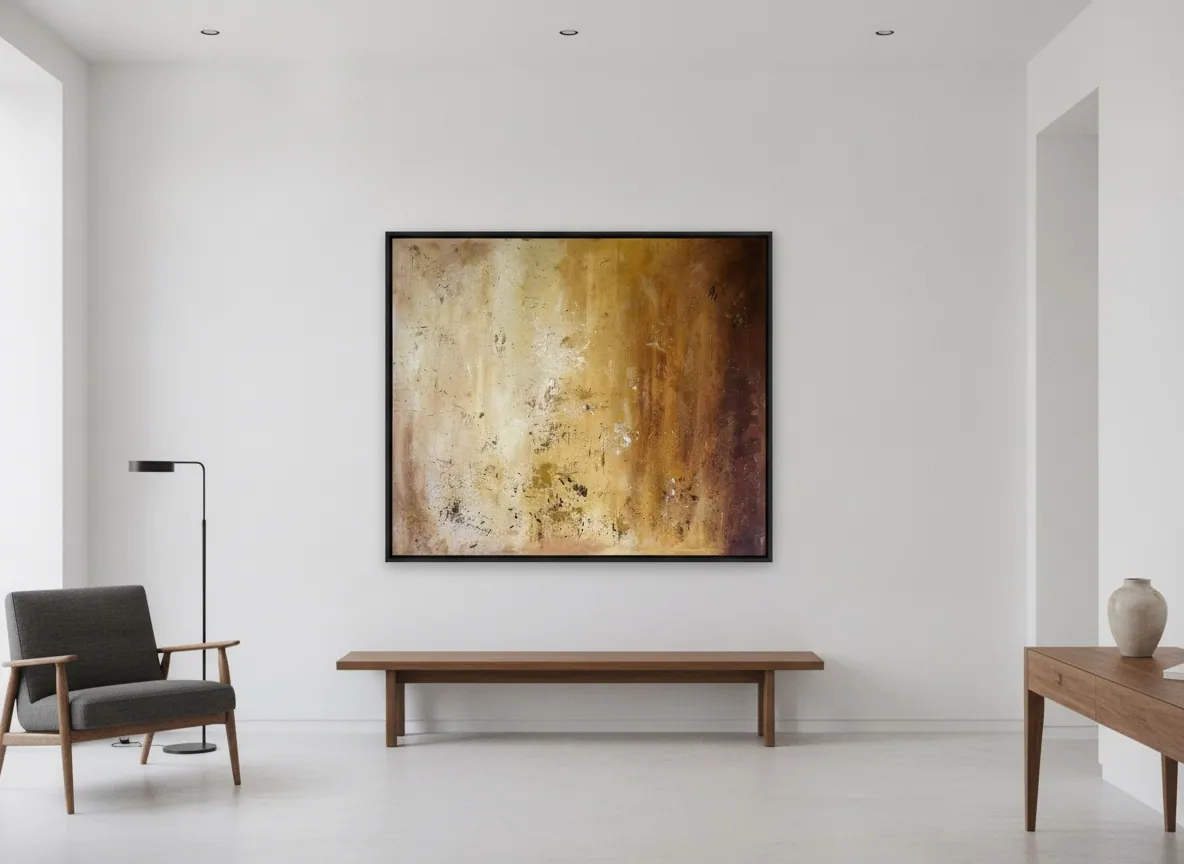
A space without partition walls has an advantage a closed office does not: the available wall tends to be taller and longer, because there is no need to interrupt it for doorways. That favors a large-format piece — something like Amber Strata (150 × 100 cm, mixed media with acrylic on canvas, Terra & Ether series), which holds presence without depending on an ornate frame or a grouping of smaller pieces to fill the wall.
Color also carries more weight here than in a conventional corporate setting. A law firm or a bank tends to choose a restrained, near-neutral palette to signal stability. A startup, by contrast, usually wants to signal energy and informality — which opens room for a livelier palette or for textural contrast (sculpted relief, gold leaf, metallic pigment) that reads as movement even from across the room, without relying on a recognizable figure or scene.
What the piece communicates to a candidate or an investor walking in
In a competitive hiring market, a startup's reception area is often where a candidate forms a good part of a first impression, before the interview even starts. A bare wall, an old event poster, or a generic decorative reproduction can communicate the opposite of what most of these companies want to project: investment in culture, in detail, in an identity of their own — not only in the product.
Original signed art solves that without an internal marketing campaign. It can signal genuine investment (a single piece, not a mass print) and give a recruiting team something concrete to point to when describing the company's culture to a candidate — something more tangible than the standard list of benefits every competitor also offers.
Budgeting for art at growth-stage: fewer approval layers, faster decisions
A growth-stage startup rarely has the decor budget of a mature company, and the purchase decision tends, in the studio's experience, to pass through fewer approval layers — often just the founder or the head of people/culture — without the facilities-and-architecture committee a larger corporation would involve. That speeds up the process, but it also means the chosen piece has to justify the spend on its own, without the institutional weight of an already-established brand behind it.
The Perfeito Studio catalog spans a range from entry-level pieces to larger-format works, which allows calibrating to the company's stage: a more compact piece for a still-small room, or a larger-scale piece once the office already occupies a full floor. Every piece ships with an invoice or receipt, a Certificate of Authenticity, and an Archive ID — documentation that fits without friction into the expense workflow a startup already uses for equipment and furniture.
From the studio
The studio's view
Before I was an artist, I trained as an architect, and a startup reception is one of the more interesting spaces to design precisely because it breaks the rules of a traditional office. There is no separate lobby, no rank hierarchy expressed in room assignment, and the leftover wall is often the same wall that ends up behind someone on a video call all day. That changes what I recommend: I ask for the real wall dimensions and the light in the room, but I also ask how the team actually uses that space day to day — whether it is where they take photos for the company's Instagram, where they record a company video, or just a walkway.
When the space is open and unbroken, I tend to point toward a larger-scale piece with fast legibility and no fine detail that only reads up close — because in a startup, almost no one stands in front of a piece for more than a few seconds. It is a similar logic to what I use for a traditional office reception, just with less institutional weight and more room for a livelier color.
Frequently asked
What art works in a startup office?
Large-scale abstract work with bold color and a composition that reads quickly from across the room tends to work best. A startup reception is usually open-plan with no separating wall, so the piece has to communicate identity on its own, in a few seconds, without depending on a quiet, controlled viewing distance the way a traditional corporate lobby does.
Should a young company buy original art or prints?
It depends on budget and intent. An original signed piece can carry more weight for recruiting and client-facing moments because it signals a specific, one-of-a-kind investment rather than a mass-produced print. A growth-stage company with a tighter budget can still choose a smaller original in a lower price range rather than defaulting to a print, since the catalog spans an entry tier as well as larger-format works.
What signals credibility to investors visiting the office?
A single well-chosen, well-scaled piece tends to read as more deliberate than several small, mismatched decorative items. Investors walking through an office for a few minutes are unlikely to study a wall closely, so scale and immediate visual coherence matter more than a detailed backstory they will not have time to hear.
What size fits a reception wall?
It depends on the wall and the ceiling height, not on the room label. An open floor plan with a tall, uninterrupted wall generally supports a large-format piece, in the 100 cm to 150+ cm range on the longer side, without needing a frame or a grouping of smaller works to fill the space. A narrower or lower wall calls for a more compact piece so it does not look undersized or crowded.
Does abstract art fit a tech aesthetic?
It generally pairs well with the visual language most tech companies already use — clean surfaces, screens, and minimal ornamentation. Abstract work communicates through color, texture, and scale rather than through a scene that needs interpretation, which tends to sit more naturally next to monitors and whiteboards than a figurative piece with a specific narrative would.
Choosing the right piece for your startup's reception
Send the wall dimensions and a photo of the space, and the studio will help narrow down a piece that fits the scale and the light.
Published on