Art for a real estate office
For a real estate brokerage's own office — as opposed to a listing being staged for sale — original art plays a permanent role: it stays after the deal closes, so it should read as a statement about the firm, not a decoration matched to one property. The strongest placements are reception, the closing room, and the wall behind the principal broker's desk, where clients sit longest and where the art appears on video calls. Choose a piece that matches the price tier of the listings the brokerage represents, buy it directly from the artist rather than through a corporate art-leasing agency, and treat it as a fixed asset of the office, not staging inventory.
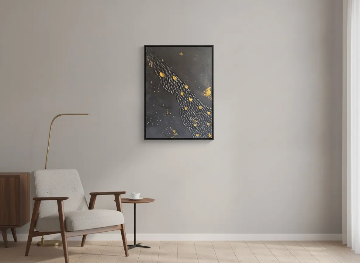
Why the brokerage's own office is a different problem than the listing
A property being staged for sale gets art chosen to flatter that specific space for the weeks it is on the market, then the piece comes down when the unit sells. A brokerage's own office runs on the opposite logic: it is the fixed address clients return to, sign at, and come back to years later when they list the next property. The art there is not competing with a buyer's imagination about how they would live in a room — it is representing the firm itself, continuously, to everyone who walks in.
That distinction matters for the buying decision. A poster or a stock print bought for a stand of listings is disposable by design. A piece bought for the office is closer to buying furniture or renovating reception: it should hold up under years of daily use and repeated client visits, and it should say something specific about the brokerage rather than filling wall space.
Where the art earns its place inside the office
Three locations concentrate most of a client's attention span and therefore most of the return on the piece: reception, where the first impression of the firm forms in seconds; the closing or negotiation room, where a client sits for twenty to thirty minutes making one of the largest financial decisions of their life and has time to actually look around; and the wall behind the principal broker's or manager's desk, which shows up in every video call and every in-person meeting at that desk.
A hallway or a corridor clients pass through quickly returns far less: the eye barely registers the piece before moving on. If the budget covers one work, it goes in the room where the contract gets signed, not the entrance everyone walks past.
Matching the art to the brokerage's own price tier
A brokerage selling starter homes and a firm specializing in luxury listings project different things, and the art on the office wall is a quiet extension of that positioning. Earth-toned, textured pieces — the Terra & Ether series — read as grounded and established; pieces with gold leaf and a graphic finish — Black & Gold — read as executive and higher-ticket. Neither is objectively better; the point is coherence with the marketing material the brokerage already uses, not a mismatch between a modest print in the lobby and a premium listing portfolio.
Orientation matters more than most offices expect: a narrow vertical piece fits between windows or beside a door, while a wide horizontal one suits a wall above a waiting sofa or a long conference table. Measuring the actual wall before choosing the piece avoids the common mistake of buying first and discovering afterward that nothing available fits the only space that has one.
Buying direct, without a corporate art-leasing intermediary
Corporate art-leasing agencies charge a curation fee to manage a rotating collection of third-party work, and that fee is built into what the client pays. Buying directly from the artist removes that layer: the brokerage sees the full catalog, chooses a piece by size and series, and receives it with an Archive ID, a technical sheet, and an invoice — documentation that lets the piece enter the firm's fixed-asset register like any other office purchase, no different from furniture or equipment.
The decision to buy art for an office is usually made by whoever also decides on the renovation or the furniture — the managing partner or the most senior broker — and it tends to move quickly once that person is looking: two or three options in the right size and series, a decision by photo, and a purchase confirmed over WhatsApp, without a committee.
From the studio
The studio's view
Because Alyne trained as an architect before she became a painter, she reads an office the way she would read a floor plan before touching the wall: where the client's eye actually rests, how far the light throws across a reception desk, whether a room is meant to impress in thirty seconds or hold attention for thirty minutes. That is why pieces from Black & Gold and Terra & Ether tend to work well in commercial settings specifically — the gold leaf catches directional light the way a well-lit closing room already does, and the earthier textures hold their own under fluorescent office lighting without going flat. Brokerages asking about office placement usually start with the closing room, then come back for a second, smaller piece for reception once they see how the first one reads on a video call.
Frequently asked
What art works in a real estate office?
Abstract, texture-driven original work tends to work best because it does not compete with the listing photography and marketing material already on display elsewhere in the office. A single strong piece in the closing room or reception, sized to the wall and matched in tone to the brokerage's own price tier, does more for the space than several smaller decorative prints.
Should the art match listing photography or contrast with it?
It should contrast, not compete. Listing photography is full of specific rooms, specific light, and specific staging choices tied to properties for sale. Art in the brokerage's own office should read as abstract and permanent, representing the firm itself rather than any one listing, so it does not blend into or get confused with marketing material on the same walls.
What size for a broker's office?
Measure the actual wall first. A closing room or a wall behind a desk usually calls for a single piece large enough to read clearly from a seated distance of two to three meters — roughly 80 to 150 cm on the long side for most office walls — rather than several small works. A narrow wall between windows or beside a door suits a vertical format instead.
Original art or print for a brokerage?
Original work holds up better for a business that has clients sitting in the same room for years, since it carries documentation — an Archive ID, a technical sheet, an invoice — that a print does not, which matters when the piece needs to enter the firm's asset records. A print can work as a placeholder, but it reads as exactly that to anyone who looks closely.
Does abstract art help sell the aspirational feel of a listing?
That is not really what art in the brokerage's own office is for. Its job is to shape how a client perceives the firm itself — solidity, taste, attention to detail — while they are deciding whether to sign, not to sell a specific property. The aspirational work belongs in the listing photography and staging, not on the wall of the office where the paperwork happens.
Choosing a piece for your brokerage's office
See sizes, series, and pricing, and get an Archive ID and invoice with the purchase.
Published on