Art for a psychology or therapy office
In a psychology or therapy office, the art that works best is abstract, low in figurative narrative, and calm in palette — the goal is to hold the wall without pulling attention away from the session. Textured, quiet series such as Matter & Silence or the mineral tones of Terra & Ether tend to sit well in this kind of room without turning into empty decoration.
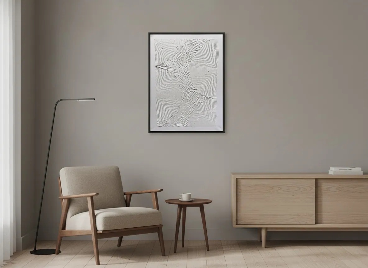
Why abstract art tends to work better in a therapy office
A psychology or therapy office is a room built for sustained, close attention, not for open-ended looking. This page makes no claim about any therapeutic or clinical effect of the artwork — it is environment curation, not guidance on the therapy process itself.
With that distinction in mind, figurative pieces — a face, a scene, a landscape with an obvious point of read — tend to invite narrative: the eye starts assembling a story instead of resting. Abstract compositions, with no single "subject" to decode, function more as a qualified backdrop — something the eye can land on without being pulled into interpretation. That's part of why well-considered therapy and consulting rooms often lean toward fields of color, texture, and contained gesture rather than figuration.
This doesn't mean generic or "waiting-room" art. A well-chosen abstract piece still communicates intention and care — it simply avoids competing with the clinical work already happening in the room.
Palette: calming without reading as sterile
In everyday interior-design language, low-saturation palettes — muted earth tones, off-white, grayed blue, deep violet — are commonly described as reading calm and contained, while saturated red, orange, and pure yellow read as more stimulating and urgent. That's a matter of common visual association, not a clinical claim, and this page makes no promise about mood or outcome.
A palette that leans too neutral, though, can slide into feeling clinical or cold — which is its own problem in a room meant to feel safe. Series such as Terra & Ether, built from mineral, earth-adjacent tones with visible texture, or Matter & Silence, in sculpted monochrome relief, tend to sit in the middle: quiet enough not to compete with the session, textured enough not to read as sterile.
Where to place it — sightlines that matter in a consulting room
Two spots matter most in a therapy office: the wall behind or beside the therapist's chair (in the patient's natural sightline during the session) and the waiting area. A piece placed directly behind the patient's own seat, where the therapist would have to look at it throughout the session, is a common layout mistake — it puts the art in the professional's field of view for hours, not the visitor's.
For a small consulting room, a single mid-size piece — in the 50 × 70 cm to 80 × 120 cm range — usually reads better than an oversized canvas that dominates a room meant to feel contained rather than dramatic. In a shared waiting area, a slightly larger or bolder piece can carry more visual weight, since it's viewed briefly and from a greater distance.
Original piece or print for a private practice?
For a private, paying practice, an original piece tends to fit the register of the space better than a mass-produced print — the same logic that applies to any professional office meant to signal permanence and care rather than a rented or temporary feel. It isn't a rule with a clinical basis, just a practical read on how the room presents itself to people who are already paying close attention to their surroundings while they wait.
A print isn't wrong for a hallway or a smaller secondary room. But the main consulting room — the one space every patient sits in for the length of a session — is where an original, textured piece earns its place.
From the studio
From the studio
Because I trained as an architect before I trained as a painter, I read a room by its function first, not just its walls. A therapy office is one of the clearer briefs I get: the art has to hold presence without asking to be decoded, because the person looking at it is already doing the hardest kind of looking — inward. That's the brief behind the sculpted, low-relief surfaces in Matter & Silence: texture you notice slowly, at the edge of attention, rather than a subject you have to resolve right away. Collectors furnishing a consulting room usually ask the same question first — will this be too much, too loud — and the answer is almost always to choose restraint in composition and let the texture carry the interest instead.
Frequently asked
What art works in a therapy office?
As a matter of environment curation, not clinical guidance, abstract art with no clear figure or narrative scene tends to work well in a psychology or therapy office, since it holds the wall without pulling attention into a story during the session. Textured, quiet compositions — like the sculpted surfaces in the Matter & Silence series — are a common fit. Portraits, landscapes, and scenes with an obvious narrative are usually better suited to a waiting room or reception area, where longer, more curious looking is welcome.
Should the art avoid triggering imagery?
A therapy office generally calls for lower-risk visual content than a home or a gallery wall would: no violent, distressing, or overtly emotional figurative imagery, since the room already holds a lot of emotional weight for the person sitting in it. Abstract work sidesteps this concern almost entirely, since there's no depicted scene, face, or event to react to — the composition works through color, texture, and form rather than subject matter.
What palette reads as calming rather than clinical?
A palette that stays warm-neutral or earth-adjacent — muted terracotta, sand, grayed blue, deep violet — tends to read as calm without tipping into the flatness of an all-white, purely clinical room. Pure white, pure gray, or very cool, high-contrast palettes can read as sterile in a room meant to feel safe rather than efficient. Texture helps carry that warmth even within a restrained color range, which is part of why relief and mixed-media surfaces often work better here than a flat print in the same tones.
What size fits a small consulting room?
For a small private-practice room, a piece in roughly the 50 × 70 cm to 80 × 120 cm range usually holds the wall without overwhelming a space that's meant to feel contained. A shared or larger waiting area can carry a bigger piece, since it's seen briefly and from further away, but the main consulting room — where a patient sits close to the same wall for the length of a session — tends to call for something more modest in scale.
Original art or print for a private practice?
For the main consulting room, an original piece generally fits the register of a paying private practice better than a mass-produced print, signaling permanence and care rather than a temporary or rented feel. A print can still make sense in a hallway or a secondary room where less attention is paid to the walls. The choice isn't a clinical rule — it's a practical read on how the space presents itself to people who are already looking closely while they wait.
Curating art for a consulting room?
Tell us the room's size and the feel you're after — we'll help you find a piece that fits.
Published on