Art for a physical therapy clinic
A physical therapy clinic calls for art that reads as movement, energy and recovery in progress — not the neutral decor of a generic medical waiting room. Gestural, layered compositions that suggest light emerging from darkness tend to sit better with rehabilitation work than static landscapes or purely decorative abstraction, and the piece has to be sized to survive a room that already has a treatment table and equipment in it.
Why a treatment room is a different problem than a waiting room
In most clinics, the waiting room is where art gets chosen first and thought about hardest — but in a physical therapy practice, the room that matters more is the one where the actual session happens. A patient in physical therapy is not sitting passively: they move, stretch, repeat an exercise, and pay close attention to their own body. That makes the treatment room closer to a movement studio than to a conventional medical waiting area, and it changes what the art on the wall needs to do.
The job is not to calm someone who is anxious before a consultation, which is the axis that works for a dental office, and it is not to create a quiet, contained atmosphere, which is the axis that works for a therapy or counseling practice. In a physical therapy setting, the art needs to hold the sense that the body is in process — improving, session after session — rather than simply resting on the wall as filler.
Gesture and emergence: what reads as recovery, not just decoration
Purely decorative choices — a generic landscape, a neutral floral print, a piece picked only to cover blank wall — tend to go unnoticed in this context, or worse, to work against the room's purpose. A composition built on gesture and emerging light does more work: it echoes the idea of a body regaining amplitude and control, one motion at a time, instead of sitting still as background.
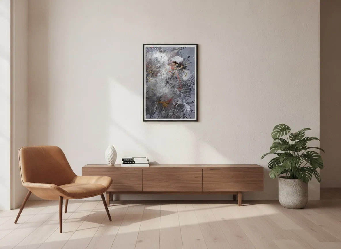
Within the Perfeito Studio collection, two series speak most directly to that register. Heart of Chaos is built from storms of gesture and pigment — paintings that capture the instant when darkness starts to give way to light, where turbulence becomes the origin point of clarity rather than its opposite. Origin of Light (60 x 80 cm), for example, works with explosions of white and scarlet moving through deep gray, with fragments of gold surfacing like small marks of resilience — a visual language close to what rehabilitation actually is: not stillness, but a body recovering range through repeated motion.
Luminous Rebirth takes a related idea in a lighter key — layered, chromatic light without the dramatic dark-to-light contrast of Heart of Chaos, useful when a clinic wants energy without visual weight in a smaller room.
Working around equipment, tables and circulation space
Individual treatment rooms in physical therapy practices are usually compact — a table, equipment, and the space the therapist needs to move around the patient. That constrains scale more than it would in a reception area or a general waiting room. Mid-size pieces, roughly 60x80 cm to 80x120 cm, hold presence on the wall without competing for physical space with the table and equipment; a piece like Origin of Light, at 60x80 cm, was framed with exactly that closer, more contained reading in mind.
Larger pieces — something in the range of 120x200 cm, like Genesis of Flame — need open wall and a longer viewing distance to register properly, which tends to favor a reception area, an entry corridor, or a group treatment room with higher ceilings rather than a single-patient treatment bay.
Corridors and shared spaces: scale for a space people pass through
A treatment corridor is seen differently than a room someone sits in for thirty minutes. People move past it — patients walking to a session, staff moving between rooms, a caregiver following behind someone using a walker or crutches. Art placed there needs enough scale and contrast to register at a glance and from a few meters away, rather than the closer, quieter reading appropriate to a single treatment bay.
Wider formats, in the 80x120 cm to 100x150 cm range, tend to hold up better along a corridor than a small, intimate piece that only works up close. The placement itself also matters more here than in a private room: enough clearance from door swings and equipment carts, and mounted at a height that reads well for someone seated in a wheelchair as well as someone standing.
From the studio
From the studio
I think about a physical therapy space the way I think about any room built around physical effort: as an architect before I think as a painter. The question isn't just what looks good on that wall — it's what that wall needs to communicate to a body that is actively moving through the space. That's a different brief than a bedroom or a living room, where art can let the eye rest; in a rehabilitation setting, it can help activate.
Origin of Light came out of exactly that moment of transition — the instant darkness starts to give way to light, white and scarlet cutting through a deep gray field. It's an image about regaining range, not about standing still. In a room where someone is, session after session, working to recover a movement they lost, that visual language has more to say than a neutral landscape chosen only to fill a wall.
Frequently asked
What art works in a physical therapy clinic?
Gestural, layered abstract compositions that suggest movement and light emerging from darkness tend to work better than static landscapes or purely decorative pieces, because they echo the idea of a body actively regaining range and control rather than sitting still.
Should the art motivate recovering patients?
It should support the sense that recovery is a process in motion, without turning into a slogan or a literal image of exercise. A composition built on gesture and emerging light does that more effectively than text-based motivational decor, which tends to read as generic in a clinical setting.
What about equipment and floor space limiting wall placement?
Individual treatment rooms are usually tight, with a table, equipment and the space a therapist needs to move around the patient. Mid-size pieces, roughly 60x80 cm to 80x120 cm, hold visual presence without needing the open wall that a larger format requires.
What size for a treatment corridor?
Corridors are seen in passing, often from a few meters away, by patients, staff and caregivers moving through. Wider pieces, in the 80x120 cm to 100x150 cm range, tend to register better there than a small, intimate piece designed to be viewed up close.
Original art or print for a rehab clinic?
That depends on budget and the tone the practice wants to set. An original, documented piece — with a certificate and an Archive ID tied to the artist's own catalog — carries a different weight than a decorative print, and for a practice that wants to signal a considered, professional environment, that documentation is part of the value.
Choosing a piece for a treatment space
Alyne Perfeito ships original, documented works internationally, with a certificate and Archive ID for each piece.
Published on