Art for a bank branch: what belongs on a banking-floor wall
Art for a bank branch's public floor is a different brief from the VIP room: the piece is seen in passing, often from several meters away, by people who came to handle a transaction, not to look at art. That calls for a contained format, a simple pattern that reads at a distance, and a palette that doesn't fight the branch's own signage — not a smaller version of what belongs in a private office.
The public floor is not the VIP room
A branch's public floor and its private banking or VIP room are two different environments, and treating them as one brief is the most common mistake. The public floor has constant foot traffic, short dwell time, and a mixed audience waiting for a teller or resolving a simple errand. Nobody stands in front of the piece; it registers in passing, often from five to ten meters away, past a queue rope or a signage totem.
The private room is the opposite: few people, longer conversations, a seated audience with time to look closely. A piece that rewards close reading — fine texture, layered color that only resolves up close — is wasted on a floor where no one gets close enough to see it. It belongs in the room where clients sit, not in the lobby they walk through.
Scale and legibility from a distance
Three things change once the viewing distance stretches to several meters: the pattern has to read as a single gesture, not a field of small marks; the format has to hold its own next to teller counters, queue-management screens, and directional signage without turning into visual clutter; and the color has to carry from across the room, since fine tonal gradation disappears at that distance the way small text does.
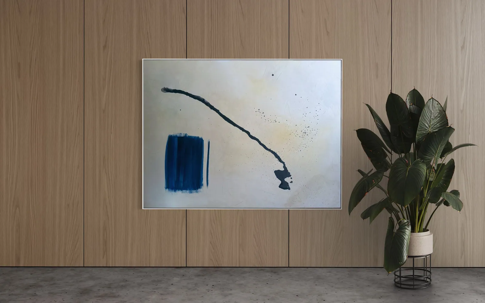
This favors a piece built around one or two large movements of color and texture over a busy, all-over composition — the kind of reading that a large-format abstract work, seen as a single shape from across the floor, is built to deliver.
Palette that doesn't compete with the brand
A bank branch's public floor already carries a fixed palette: the brand's colors on signage, counters, and uniforms are non-negotiable and repeat throughout the space. Art placed into that floor either sits inside that palette or works as a deliberate, quiet counterpoint — a warm, earthy or metallic register against a cool corporate blue, for example. What doesn't work is a piece whose dominant color argues with the brand color at the same visual weight; from a distance, the two simply blur into competing signals rather than one composition.
A neutral or muted base with one accent color tends to travel best across different branch interiors, since it doesn't lock the piece to a single signage scheme.
Original work or a print — and what it changes
A branch buying for one location, or for a small group of branches with different wall dimensions, is often better served by a print or a size-adapted edition of a piece than by chasing one original canvas per site — reproduction removes the constraint that the original has to be the exact size of the wall in question. An original still has a place: a flagship branch, a headquarters lobby, or a single site the institution wants to signal as its most invested location benefits from the fact that the piece is unrepeatable elsewhere.
Either way, the studio can quote both routes for the same composition, sized to the wall in question rather than to a fixed catalog dimension.
From the studio
The view from the studio
Alyne trained as an architect before she trained as a painter, and it shows in how she reads a commercial floor plan before proposing a piece: where the queue rope sits, where the light source comes from, how far the nearest bench or counter puts a viewer from the wall. For a public banking floor she tends to steer toward pieces from Terra & Ether or Matter & Silence — sculpted texture and a contained palette that hold their shape from across a room without needing gloss or gold leaf to register. Gold leaf, when it comes up for this kind of project, is usually pointed toward the private room instead, where someone stands close enough for the metallic surface to catch the light rather than just glare under fluorescent panels.
Frequently asked
What art works in a bank branch?
On the public floor, a piece with one or two large, simple movements of color and texture — legible from several meters away — works better than a densely detailed composition. A contained abstract format that doesn't compete with signage or counters, in a palette that sits inside or quietly complements the branch's brand colors, is the safest starting point.
Should a private banking room have different art from the public floor?
Yes. The private or VIP room is a seated, close-viewing environment where a piece with fine texture or layered detail rewards a longer look. The public floor is a passing-glance environment, so the same logic of restraint applies but in reverse: simpler, bolder, and readable at a distance rather than up close.
Does gold-leaf art fit a financial setting?
It can, but placement matters more than the material itself. Gold leaf catches and reflects light, which reads as considered and warm at close range in a private room, but can glare or compete with overhead lighting and screens on a busy public floor. It tends to work best in a room where someone sits close enough to see the metal catch the light, rather than on a wall seen only in passing.
What size for a branch lobby?
It depends on the wall and the viewing distance, but a piece in the 100 × 100 cm to 150 × 100 cm range generally holds its own on a lobby wall seen from across a floor without needing a monumental scale. A narrower wall segment, such as beside an entrance, can work with a taller, narrower format instead — the studio sizes to the wall photo or plan rather than to a fixed dimension.
Original art or print for a bank?
A single flagship or headquarters location often justifies an original, unrepeated canvas. A branch network with several locations and different wall sizes is usually better served by a print or a size-adapted edition of the same composition, since reproduction removes the constraint of matching one original to every wall dimension across sites.
Sizing a piece for a branch floor or private room
Send a photo or plan of the wall and the studio will propose a composition, size, and format — original or print — for the space.
Published on