Are the colours accurate when you buy a painting online?
No photo of a painting is a perfect color match to the canvas — your screen's calibration, its color gamut, and the room's ambient light all shift what you see, sometimes by a visible margin. The gap is real but manageable: a well-lit, color-corrected photo on a calibrated screen gets close, and the remaining difference is almost always in saturation and warmth, not in the composition or the palette family itself.
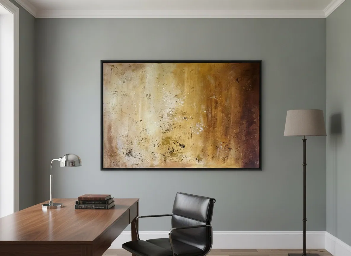
Why a photo and a canvas are never pixel-identical
In the studio's own pieces, metallic pigment and raised texture paste catch light differently depending on the angle you view them from, and a photo flattens that into one fixed exposure. Even a technically perfect photograph is a translation, not a copy.
Two more variables sit between the canvas and your eyes. First, the color space the photo was captured and exported in — most professional photography and web publishing uses sRGB, the color space standardized by the IEC as IEC 61966-2-1 specifically to keep color communication consistent across cameras, screens, and printers (W3C). Second, your own monitor: no two screens render sRGB identically unless both are calibrated to the same reference.
What actually drifts: your screen, more than the photo
According to EIZO, a manufacturer of color-critical monitors, a display's color temperature and brightness change gradually with normal use — a monitor set to 5,000 K and 100 cd/m² when new can drift to roughly 4,500 K and 90 cd/m² after a few months, and no two units, even identical ones fresh out of the box, measure exactly alike (EIZO). EIZO recommends recalibrating a professional display every 200–300 hours of use to keep it dependable.
In practice, this means the single biggest source of color mismatch when you shop for art online is rarely the photograph — it's whichever screen you happen to be looking at it on, and whether that screen has ever been calibrated at all. A laptop set to maximum brightness in a sunlit room, or a phone with an aggressive "vivid" color mode, will push warmer or more saturated than a calibrated reference monitor, in either direction depending on the device.
What the studio does to narrow the gap
For the close-up detail shots of texture and signature, the studio's documented practice is natural daylight rather than mixed indoor lighting — a more consistent reference than typical indoor bulbs, which tend to push a photo warmer or cooler than the actual paint. When a detail matters to your decision, asking for an extra daylight photo of that passage is a reasonable request.
What this process cannot fix is the viewer's own screen. If you are comparing, say, the deep bronze tones in Amber Strata against a warmer or cooler monitor, the hue family and the contrast between layers will still read correctly — the exact warmth of the metallic passages is the part most likely to shift.
What tends to shift, and what doesn't
Saturation and warmth are the most screen-dependent qualities of a painting photo — an overly bright or "punchy" display setting can make reds and golds look more intense than they are on canvas, while a dim or cool-calibrated screen mutes them. In the studio's experience, the metallic and raised-texture passages are the hardest to convey in a photo at all, since they depend on a viewing angle a static image can't capture.
What tends to hold up across most screens is the composition, the relative contrast between light and dark passages, and the palette family — whether a piece reads warm or cool, earthy or luminous. If you're deciding between two pieces from different palette families, that structural read is usually reliable even on an uncalibrated screen; the fine-grained warmth of a single piece is where you should expect the largest gap.
From the studio
The studio's view
Alyne works in layers — acrylic under metallic pigment, texture paste under a top glaze — and those layers are built to catch real light from more than one angle, which is exactly the part a flat photo compresses into a single reading. When a client writes in unsure about a color after seeing it only on screen, the studio's answer is always the same: describe the room's light and the wall it's going on, and we'll walk through what the piece does in daylight versus lamp light, rather than promising the screen will match it exactly. That conversation, more than any single corrected photo, is what closes the gap.
Frequently asked
Will the painting look exactly like the photo on my screen?
Close, but not identical. The composition, contrast, and overall palette family will match; the precise saturation and warmth can shift depending on your screen's calibration and brightness setting, and metallic or high-gloss passages are the hardest to capture in a static photo.
Why do colors look different on my phone than on my laptop?
Phones and laptops often use different color profiles and default brightness or "vivid" display modes, and neither may be calibrated to the sRGB standard most web photography is exported in. That's a property of the devices, not of the photo itself — the same image file can look warmer on one screen and cooler on another.
Does Perfeito Studio color-correct its photos?
The studio's documented practice for its close-up detail shots is natural daylight rather than mixed indoor lighting, since daylight is a more consistent reference than typical indoor bulbs. What no studio-side choice can control is the calibration of the screen you're viewing it on — which is why asking for an extra photo of a specific passage is always reasonable.
Should I calibrate my monitor before choosing a painting online?
If you're deciding between two pieces with a close color relationship, it helps. Full calibration needs a hardware tool most people don't own, but even a basic step — turning off an aggressive "vivid" or "dynamic" display mode and viewing in a normally lit room — removes the most common source of color exaggeration.
Can I ask for more photos before buying?
Yes — a reference photo in natural daylight, or a close-up of a specific passage like a metallic or textured area, is a normal request and the studio can send one on WhatsApp before you decide.
Unsure how a color will read in your space?
Send us a photo of the wall and we'll walk you through how a piece behaves in your light — before you decide.
Published on